I recently realized that some kanjis such as 令 have two different forms and i only recognize the one i learned which is this one: Imgur: The magic of the Internet
This was the case for maybe 20% of the kanjis so i gave up pretty quickly.
Which one is the correct version? Even when I copied from the page for the kanji itself (which was the 1st version obviously), when I paste it here it becomes the second version… I’m now wondering if I somehow learned the wrong version for a lot of kanji…
As far as I know it’s just different fonts? The second one is how it’s handwritten I believe. Like when you write a lowercase “a” on a piece of paper you don’t write it the way it looks in a computer font, right?
There’s probably better responses than this but this is how I experienced it.
phew, so i learned the correct version, now how can i make it so my ipad shows me the correct version too to be clear, i checked in firefox and it shows the correct version, only in the app it’s wrong
The one from your ipad image is using textbook typeface, the one from your WK image is using gothic typeface. Textbook typeface is used by any textbook you may read, so it’s useful to be able to recognize it.
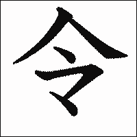
All of these are valid renderings of 令 in Japanese (left-to-right: gothic, mincho, textbook, square, semi-cursive, cursive).
Sure not. Tobira uses textbook typeface everywhere.
(Edit: Just checked, actually it’s not used everywhere. All dialogs and reading passages use textbook typeface, but vocabulary lists and grammar explanations use gothic typeface.)
