I have a short question. Currently i stopped using wanikani for a while because i need to get my Hiragana and Katakana burned into my mind! But i’m running in some problems with fonts.
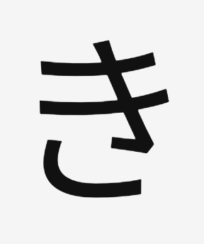
I currently use https://kana.pro/ to quiz myself on my hiragana and katakana knowledge. But there is a slight change between some fonts in hiragana (maybe also katakana but i’m not sure yet). I’ve added to images of “ki” to this post. Any help on how to overcome this hurdle is appreciated
You’ll basically just have to see both styles enough times. That’s the only solution. The same thing happens in latin fonts, but you probably don’t think about it, as you’re so used to them. See for example the two radically different ways of designing an “a” You wouldn’t even think about this if you were just reading. (Similarly to the japanese ones you’ve shown, one way of writing is more common with handwriting, and one is more common on computers)
TL;DR: Fonts gonna font. You’ll just have to get used to it.
When I first encountered this problem, I thought I’d never be able to learn Japanese… But then I decided to keep going on. I hope you too won’t be stopped by this problem.
If you want to get some practice in at recognising different font styles: https://realkana.com/
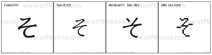
The き on the right is how it appears when handwritten. さ, む, ふ, そ and り also have noticeable differences when handwritten, and that’s not even getting into the really cursive style that old people use…
Think about the differences between printing and cursive writing - the third one has the writer picking up their writing implement before finishing the character, while the others are written in one continuous action.
EDIT: Nath beat me to the punch while I was looking for examples!
Think of the lowercase letter f printed and in cursive (couldn’t readily find any images, sorry).
Hmmm i just thought of something. Please say so if i’m wrong. But is it the same as in Roman character languages that if you can’t read 2-3 letters from a 6-7 letter word you can still see the word because of experience? Sorry for the horrible explanation haha!
Do you mean that even if part of the character is wonky/missing people will still recognize it?
If so, yes, but I don’t think the mechanism at work is the same.
In the case of one hiragana character, there are relatively few possibilities, so it’s easy to match the closest looking one.
In the case of a word, it’s more due to the way words are stored and access in the brain… but maybe it’s the same in both cases anyway… I’m not a brain expert.
You mean like if I blurred out the middle letters of, say, “Special” so that you got “Sp—al” I can still understand it? For Japanese, I’d say it’s less doable, but still a thing, certainly.
Okay last question haha. Sorry for overloading with questions…
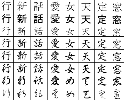
I’m trying to get some reading done in manga’s. I’ll not understand it but at least i get some more training with my hiragana. And often i see something like this:
What does the | mean? I have not learned that yet?
The visual recognition of the physical shapes of a letter or word on a page (in Roman letter alphabets) does use a similar mental process for each, and the inability to do this readily is a component of dyslexia. You are asking specifically about visual closure, though for words that is then also combined with bouma (recognising the shape of a word - this itself relates to the fact that lowercase words are easier to read than uppercase words) [gawd, I’m rusty!]
EDIT: Sorry, realised I didn’t fully address what you asked. If a non-cursive kana is written in the same way as a cursive kana but for the ‘gaps’ where the pen is lifted, then visual closure can play a part in recognition if one is first familiar with the cursive version (such as the third そ above).

