I’ve noticed that certain Japanese characters have one form that is most common in type-face, but a different form if you look up the stroke order (using platforms such as KaniWani).
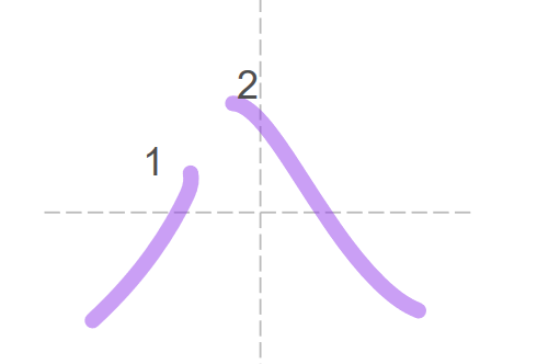
To give a simple example, “hachi” usually shows up in typeface as 八 but can occasionally show up as ハ. The stroke order on KaniWani looks closer to the second form:
Or for another example, “down” (した) usually shows up in typeface as 下, but KaniWani says the stroke order looks more like this:
There are many more examples than this, but these are just a few that I encountered. Are the second forms the correct ones for handwritten kanji? What is causing the discrepancy? I tried doing research on this, but only found info on Chinese vs Japanese characters and old vs new kanji style forms, however I have a Japanese keyboard installed on my computer. Also, I couldn’t find any information relating to the examples above.
I think you’re thinking too hard about this. Look at it this way, for example:
It may be that you handwrite the alphabet the same way it displays on a screen, but think of cursive writing (or any form of hybrid writing that is neither print nor cursive). A lot of letters will be very different compared to the default font used in computers and such (some of them will look nothing like the original). There is naturally a discrepancy between the two versions.
It may be more complicated than that in the case of Japanese, but that’s my simple answer (I like simple answers). Handwriting is just different, we don’t write everything the same way we see on a screen.
Neither of the forms is wrong, they’re just seen in different contexts. There are also fonts (used in textbooks, usually) that try to reproduce the handwritten versions of kanji to help the student learn to write them.
So, would it be correct to say that 八 and 下 would only be seen in typeface (you should never hand-write it this way), whereas the hand-written form should always look like ハ ?
I am just concerned because I do not want to follow the stroke-order diagrams, only to learn later that I’d been writing them wrong and need to relearn them all, you know what I mean? I guess I should just assume the stroke order diagrams always indicate the correct hand-written form?
I don’t read a lot of handwritten Japanese, but you can trust the stroke-order diagrams. In the end I think everyone develops their own way of writing things so it might not end up exactly like the diagrams, but that’s probably the best place to start
And just for the record, I don’t think anyone writes 八 ← like this. At least I’ve never seen it. Writing 下 ← like this doesn’t seem too weird though.
In all languages written and typed fonts differ. Even typed fonts differ. There is a script that randomizes the fonts on WK reviews, it helps you recognize kanjis written in different fonts:
It is best to follow store order when hand-writing kanji. After some initial time getting used to it, it makes sense and produces more accurate kanji faster and easier.
The discrepancy is because certain fonts have been optimized for printing presses or displaying on computer screens. This means certain simplifications and changes have been made in order to accommodate these mediums. Think of it as being the same as you can see things like the lowercase g that is often used in print like in the following:
Almost no one actually writes a G this way in handwriting though that I’ve ever seen.
Apologies for a small thread derailing, but I write both my upper and lowercase G’s like a typical sans-serif font (G, g). I guess I don’t look too closely at my friend’s notes but I thought that was common. Do you do more of a cursive uppercase G, and what about your lower case g’s?
Not really… many people do hand-write that way (esp. when writing “block” letters, as opposed to cursive). Here’s an example from a popular YouTube calligrapher:
Anecdotally, for the number 8, typefaces designed for Japan and Taiwan tend to display 八 while fonts meant for mainland China & HK tend to style it closer to ハ.
His 八 correctly has the second stroke starting higher than the first stroke… that’s normal for handwriting.
Generally speaking, if you write your kanji like fonts people will notice it and probably assume you never were taught handwriting.
The 下 example isn’t really that good of an example for “font writing” because you see both styles in fonts and handwriting. A better example would be something like shinnyou (the left radical in 近). That should never be written like the font version.
Additionally, when the shinnyou can be printed with two dots or one (as in 謎 or 遡) because it was updated more recently than others, the two dots are an remnant of the old printing style and it should always be handwritten with one dot. There is some confusion among people who aren’t aware of this though, and so you will occasionally see fonts that are meant to look handwritten that have two dots. This makes no sense historically.
Though I don’t want to speak for the original poster, I think they meant that the curly style is commonly used when typing but that people usually write it in the same way that you do. I’ve seen some people write lowercase g’s the ‘curly’ way, but that’s rare.