Is the default look not for you? No worries, you can easily change it!
All you need to do is copy a custom props sheet into Stylus and change the colors / filters as you see fit.
You can find a step-by-step guide on GIT.
Userscripts are great for enhancing your wanikani experience, but also a pain to work around when it comes to theming. So to solve this issue, the main WKED theme can be expanded upon, by loading in additional userscript specific modules, which will dynamically synchronize their color palettes.
It’s nice to have an alternative to breeze dark. Thank you.
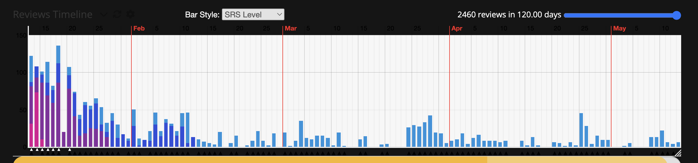
Nicely done! Hover effects and everything. It seems to play well with everything I use at first glance, except for the ultimate timeline plugin. All of the official pages I’ve looked at this far look great (including the radical/kanji/vocabulary summary pages which were a problem with breeze dark for a while).
Holy, thats a bunch of feedback way sooner than I expected, thanks! I’m glad most of it works, I was a bit worried, since I never shared any css amalgamations of mine before.
I myself don’t use any plugins atm, so I knew going in, the compatibility would be iffy, but I could take a look at it tommorow morning. If there are others that misbehave add them to the list and I will go through them.
Custom colors are a neat idea, I will definitely do that as some point in the future, not sure when tho.
I never got why people were so pushy about dark themes until I started using them myself. Now a sudden light theme page is an assault on my senses — it’s physically painful!
Dark theme is important. Breeze Dark has been working well enough for me lately, but I will definitely try Elementary Dark for a while.
Any theme is going to be a bit brittle (WK changes things – for the better – on occasion) but this looks extremely promising.
Do you have this in github? I’m going to hack on it a bit and would be happy to submit a PR.
I usually speed through easier reviews and start typing reading or meaning already simply based on color muscle memory. The script makes the coloring pretty similar so that on reflex I already typed out half the meaning when I have to dial it back because it wants the reading and vice versa
Did I swap the meaning and reading background colors? Oh no D:
As far as I can tell the meaning/reading colors are the same as in the default wanikani theme. But I could add the option to swap them around or potentially choose entirely different colors. For now I will add it to the issue pile.
Oh you are probably comparing it to breeze. Indeed it has reading distinguished by lighter shade of gray compare to meaning. I will add an option to invert the colors later today.
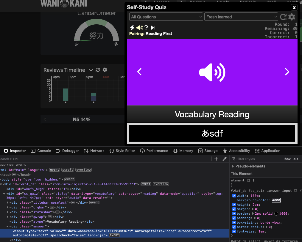
Just pushed out version 1.0.4, you should be able to change the colors of reading/meaning headers in quizes by altering one or more of the following variables at the top of the file
It might still need some changes to work in lessons, but as I dont currently have any. I have no way of checking for compatibility there.
Aaa, your work is just amazing, a spectacular alternative for Breeze Dark. Not to mention for some reason Breeze Dark just looked a bit distorted and a bit buggy, Elementary Dark actually works for me perfectly.
Thank you so much for your time in this Style, and good luck with those reviews
Thanks for providing an alternative to Breeze Dark. I will give it a go. I’m very used to Breeze Dark’s theme and even its quirks at this point, though. The screenshots from Elementary Dark look slick (and sick).
As I suspected, I was way too lenient with some of the selectors. In this case the script was picking up on a generic input[type="text"] style. For now I made the selector in question more strict, so it should be usable with the current version 1.0.5.
Unfortunately some elements are still picking up on what they shouldn’t. I need to go through the stylesheet and remove most, preferably all, of these generic selectors.
But that is an issue for another day. Hope this partial fix at least suffice for now
You previously said that you don’t really work with any userscripts installed, but I think the Stroke Order userscript is a widely used add-on, so I just wanted to give some feedback. If you think it’s worth your time, then I think it’d be amazing to make this look actually readable!
I’ve been a busy little beaver stealing ideas from open-props and adding them to Extreme Dark. Ideas that are proving to be amazingly useful. They make user-styles consistent across pages and dialogs (no more “which color red was I using to indicate that?”).
I’ve got a PR in to Sepitus that will make it easier (and more manageable/maintainable/supportable) to add support for arbitrary userscripts (among other things).
The basic idea:
WK Elementary dark defines a bunch of custom properties for coloring by semantics (things that indicate Kanji vs. Vocabulary use var(--ED-kanji-clr), things that represent the Guru stage vs Apprentice stage use var(--ED-guru-clr), things that indicate progress, and so on.
The base stylesheet themes the official WK pages only. (We might eventually relax this and also add styling for the most common userscripts that don’t have dark mode or adjustable colors).
Anyone that knows a little CSS can fairly easily write a stylesheet to over-write any userscript’s colors. We can maintain a github respository for those, but they are just text files that can be easily shared, or just made for yourself. (I’ll post a video of how to do it – it’s not rocket science.)
Script owners can also write or modify their scripts to be compatible by using fallbacks, e.g.:
I may eventually write an app that lets people visually create and store their own color themes using this system. It could present mockups of the dashboard or other pages to show you what your chosen colors would look like.
By the way: I did all this with Elementary Dark mainly because it was just released and is starting fresh, not out of any sort of concern/dislike with Breeze Dark or whatever.
So it’s been over a month now. A lot of things happened, a lot of things changed. But at last, you can install a module that will make the Stroke Order script serviceable. Whats more, it will now use the same color palette as the theme itself.
I’ll add another reply to the thread to bump the activity in the hope that more people find this.
@Everesh really did all the heavy lifting, he accepted a bunch of my suggestions but the hard part is starting with a blank sheet of paper, not kibitzing.
This is much more than just another dark theme now. It’s a framework for building your own them now, in case you aren’t completely satisfied with @Everesh’s beautiful color scheme or my much more intense but logical theme.
Make everything whatever color you like! I’ll be announcing another tool imminently that makes this process fun and easy.
Most important highlights about this stylesheet:
WKED uses a semantic naming convention and CSS custom properities (aka “CSS variables”) for everything. This makes it much easier to style things however you like.
“Semantic” naming means we named properties based on the meaning of the things they style, instead of where they are or what color they are. For example, we have properties named --ED-kanji, --ED-vocab, --ED-apprentice, --ED-text, etc… You should be able to guess what those properties affect on any given Wanikani page.
Custom props mean you should never need to edit the WKElementaryDark stylesheet itself. Instead, if you want to use different colors, just create your own stylesheet and override just the properties you want to change (examples are available).
The WKED stylesheet itself only styles the default Wanikani pages for the most part. We’ve created some adjunct stylesheets for common userscripts to make them pick up WKED styling (WITH whatever overrides you specify). We (or others) can add to this collection over time. (Open framework menus and the self-study quiz are included by default – currently the only exception).
Everything is under revision control, so it should be feasible to keep things manageable as Wanikani inevitably makes changes. Who knows, maybe someday they’ll support an official dark mode!


