I have just deployed an update to the dashboard which concludes the work on removing legacy code from Wanikani. While most users will be unaffected and won’t notice this change, I suspect anyone running scripts that show up on the dashboard may have to adjust their scripts to work with the new DOM.
This update includes quite a large cleanup removing many older technologies and libraries from our codebase. For example jQuery is now completely removed, as is tailwind, react, bootstrap, along with many others. A lot of first party code and css that is now no longer needed has also been removed. To give you some idea of the magnitude and significance of the clean up, I removed about 167,000 lines of code with this change.
As always let me know if you have any concerns and I will do my best to support where I can.
Well done! I appreciate the effort and the announcement explaining what was done.
The first thing I noticed with the new change is that now the text on the reviews forecast section is quite a bit smaller than before and a bit hard to read now. Not a big deal at all, but was that an intentional change or did it happen by mistake?
Can you provide a screenshot please. There were no changes to the review forecast and no visual difference from my testing. I could not see any change after checking now on production also.
The text was about 20% larger previously. If I zoom my browser by 20% the text appears as normal again (but then the UI component itself is way too huge).
Edit: Another super minor thing I’ve noticed is that hovering the mouse over the buttons (Start Lessons, Start Reviews, etc) no longer shows an underline or thickens the outlines. There’s no visual feedack at all. (obviously it’s totally fine but just wanted to make you aware since it’s hard to notice those things without people reporting them)
That is strange. The screenshot you sent looks correct to me so something must have been awry before. As you say it isn’t a big deal that it has changed for you, but curious nonetheless.
FYI, it has changed for me as well. Given that like half of the userscripts I use/d affect the dashboard in some way, and apparently most of them need to be fixed up to adjust to the changes, it’s more than likely it was some weird subterranean interaction there.
For me (Brave browser, Windows 11 laptop), the reviews forecast now sits within a smaller enclosing box, which requires a horizontal scroll to see all of it properly, and which has a long and unnecessary vertical extent and scrollbar.
But I guess that is happening only for certain responsive browser widths (such as the typical width that I use).
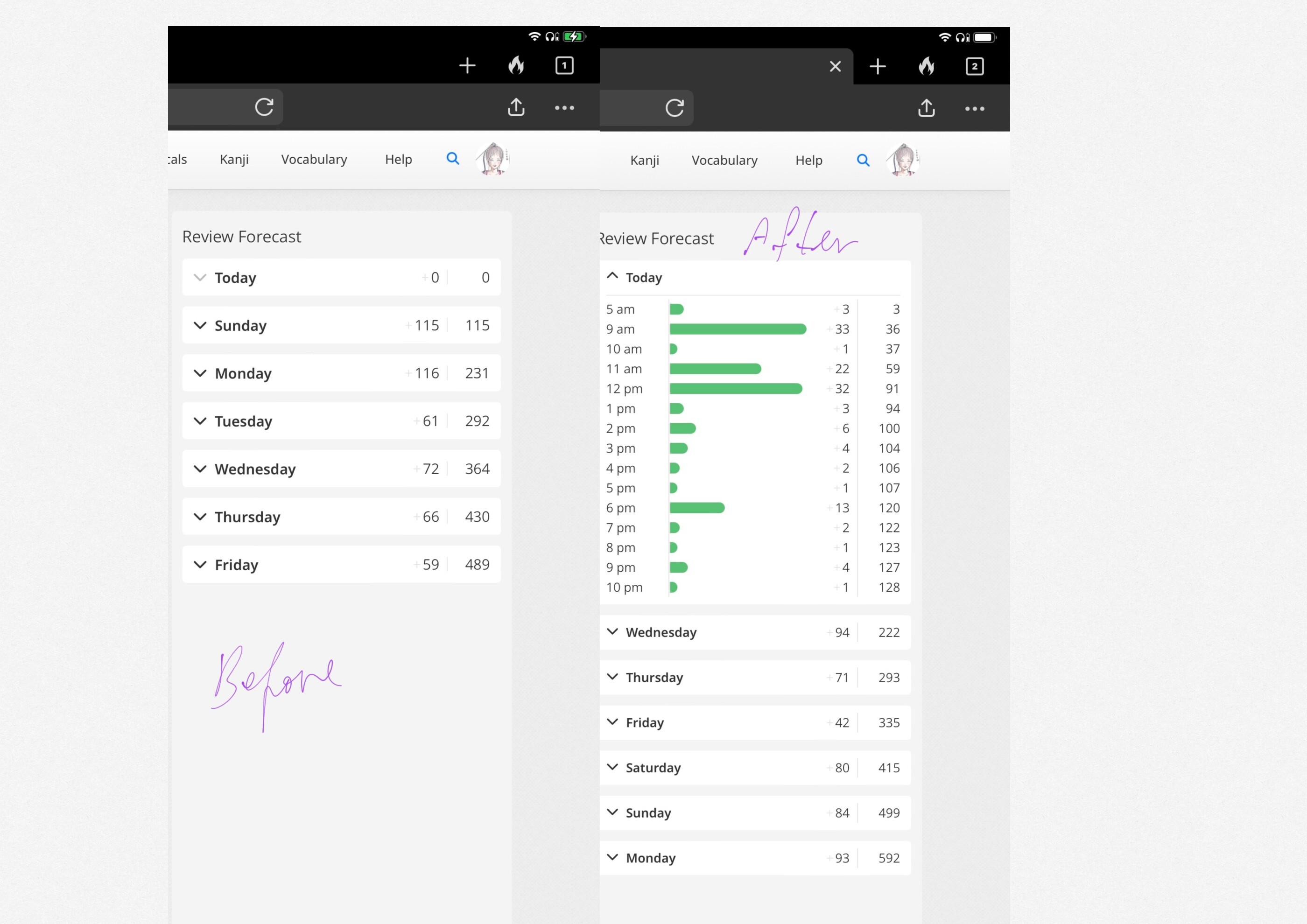
Happend to have a screenshot from july 13th. There is definitely a difference, as you can see the before and after. It’s the same with the levels item lists.
Thanks for that. After digging a little deeper the font size did change (sorry I got that wrong @Cookie316). It is meant to be 14px aka --font-size-xsmall but the old dashboard had some overrides to make it play nice during the migration. Those overrides were removed and now the font is correctly showing the smaller font size.
I am working on an fix for the overflow issue mentioned by @servette
Glad I could help with the screenshots.
Do you think you can do something about the color contrast of the diagonal bgcolor blocks of the closed items of the vocabulary lists?
The text itself is crispier which is great, but the background really flickers when scrolling. I’ve been using those lists a lot lately and it started to be like that only after the update.
I’m also seeing what could be a vertical scrollbar (albeit empty) positioned to the right of the Review Forecast box. This shows up with all browser window sizes, including full screen. I’m running latest Chrome on macOS Sonoma.
I have just released a fix for this. The scrollbar shouldn’t appear and the numbers should behave a little more uniformly. @servette Could you let me know if this is fixed for you also?
Apart from that, unless I’m imagining things, the site seems to be loading much faster now since the update!
We are now using turbodrive everywhere so the site should feel much snappier. I didn’t want to make too much of a thing about this performance improvement as peoples mileage may vary, but I am glad you have noticed.
A minor issue, but I was looking at the site on my iPhone 15 and noticed that the WaniKani Community logo isn’t responsive on small viewports/mobile (both Safari and Chrome). Setting width: 100%; fixed it in the Chrome inspector.
Is that permanent underline intended to be there? The way it’s just a few pixels below the line formed by the bottom of the image looks awkward if is. But also it makes the last sentence look like only that is a link, rather than the entire button.
Note that as many of the scripts pages themselves say, that’s not really Wanikani’s responsibility but instead for the script authors to fix (who are volunteers, so you may have to wait)
Thanks for the update! Unfortunately I still see the bar on the right.
I’ve tried doing a full refresh of the dashboard and clearing the cache, but the bar… it lingers.