Hello Script & 3rd Party App Developers (and also the people who use what they make)!
Dashboard is getting a big update. A complete overhaul, really.
Kind of wanted to just surprise everyone and just launch it, but thought: all the scripts are going to break.
So, at the very least I wanted to post here to let script developers know ahead of time, even though it will be somewhat unhelpful. At the very least, if you’re able to keep the topics of this post inside this topic, I’d appreciate it, and perhaps we can keep this a fun (or aggravating) surprise for more people.
So, this is to tell you about it, so you can mentally prepare. Maybe prep some updates? I’m not quite sure what I can do right now exactly, but I’m going to give you what info I can. And, please let me know what questions you have and I’ll do my best to answer them (or ask people who can).
When will the new dashboard go live?
We’re planning to push it live on October 6, that’s a little under two weeks from now. If something comes up in the meantime, we may change that date. That said, I think we’re pretty good for Oct 6.
What’s changing?
The Dashboard’s getting a complete overhaul.
First off, it should be a lot faster. Feel snappier.
I also think it looks way better (but, of course, that’s just my opinion).
Here’s a sneak preview of what my dashboard looks like:
(if you want to be surprised then don’t click this!)
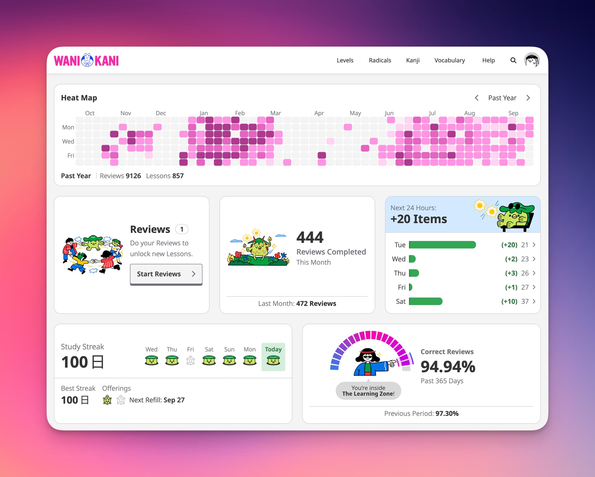
The new dashboard is now a series of “widgets.”
You will be able to choose which widgets you want to see. And, you can now remove widgets you don’t want.
Technically, you could remove every single widget, if you really wanted to.
You can also move widgets around. Put them where you like.
And then, you can resize them. On a larger, “desktop” sized view, widgets in can take up 33, 50, 66, or 100% of a row.
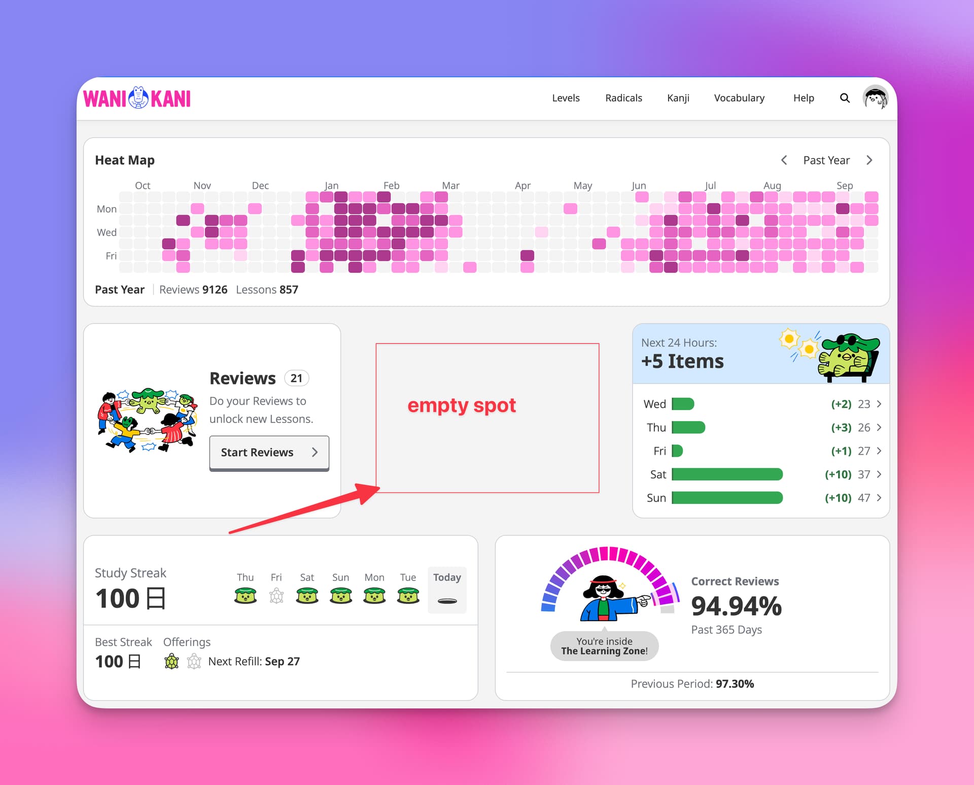
You can also create blank / empty spots in your widget rows. Which, I think, may be of some interest to the script developer community? ![]()
Many widgets will also have their own individual sub-options, e.g. time periods to cover, hiding/showing information, etc. You are also able to choose a color palettes for most widgets. My personal favorite palette is “Blood & Matcha.”
In doing this dashboard update, one of our goals was also to cover some of the functionalities that widgets were covering before. The scripts tend to be more fully featured and really get into the weeds of things (in a good way), but I hope that some of the new features we’ve added along with the widgetized dashboard will do the job for the regular users out there. e.g. now there’s a streak widget, as well as a heat map widget.
We also made sure that all the features that were on the old dashboard made it into the new dashboard, even the ones we didn’t really want to keep. But there they’ll be, and you can choose to add them to, or remove them from, your dashboard. You even have the option to keep the sacred neon blue and pink Lessons and Reviews widget colors, if you want them.
Finally, we also updated the functionality of some of the existing widgets and made them better.
All in all, the new dashboard is a way better experience. I’ve been using it for a little bit and can’t imagine going back. That said, I know how hard change is, no matter the change. There’s going to be some friction ![]() Much more so if you’re using scripts on the dashboard, and they suddenly disappear or break.
Much more so if you’re using scripts on the dashboard, and they suddenly disappear or break.
Why update the Dashboard?
We really did put this one off for a while. I didn’t want to mess with all the scripts. But, we got to the point where there was just too much benefit (for the learner). And, it was holding us back from being able to build some features that we think will be really helpful. Our thought process here on why we’re updating the dashboard:
- It’s going to give us a lot of flexibility in terms of the features we’ve wanted to build but couldn’t. With individual widgets being optional, we’re going to be able to create features that are not for everyone, but very good for some people. If that’s now you, you’ll just be able to remove it (or not add it).
- It gives the learner more flexibility as well. They can customize their dashboard to fit their style of study better. Put what’s important to them, on top. As we add more features and widgets to the dashboard, learners will be able to make adjustments however they see fit.
- As we add more content, we want to make it possible for learners to focus on what they want to focus on. Our goal for every learner is the same, but each learner’s individual goals for their studies are different. This is still a first, early step. But a more personalized learning experience is something we are working toward. Without saying more, this new dashboard really helps set us up to do that.
In the old dashboard, we were pretty locked into how / what we were doing. You get a taste from some of the new widgets, but there’s a lot going on now behind the curtain that we wouldn’t have been able to do very well until we updated the dashboard like this. Personally, I’m pretty excited about some of the not-useful-for-everybody widgets that we’ve spec’d out. Some of them are really weird.
Old Structure → New Structure
And finally, I was trying to think up what might be helpful to script developers to prepare, even if it’s just a little bit (I realize this isn’t actually super helpful. I’m sorry. But I hope it’s something.).
Here’s the old dashboard structure:
<div class="dashboard">
  <div class="dashboard__content">
    <section class="dashboard__lessons-and-reviews">...</section>
    <section class="dashboard__recent-mistakes">...</section>
    <section class="dashboard__extra-study">...</section>
    <section class="dashboard__level-progress">...</section>
    <section class="dashboard__review-forecast">...</section>
    <section class="dashboard__srs-progress">...</section>
    <section class="dashboard__item-lists">...</section>
    <section class="dashboard__community-banner">...</section>
  </div>
</div>
And here is the new dashboard structure.
<div class="dashboard">
  <div class="dashboard__content">
    <div class="dashboard__row">
      <turbo-frame src="widget-url"></turbo-frame>
      <turbo-frame src="widget-url"></turbo-frame>
      ...
    </div>
    ...
  </div>
</div>
Widgets live inside rows. Rows are ordered. Height of rows is based off the tallest widget and other widgets in a row will stretch taller to be the same height of that tallest widget.
That’s basically the whole setup, I think.
I’m not familiar with how each individual script and such are set up, but hopefully having something to hook on to with a script will help. And, hopefully seeing some of the images of the dashboard will help, too. Give you an idea of what you can do / where you can do it.
Again, likely that we push the new dashboard out on October 6. I’ll be sure to drop an update here 24-48 hours before to confirm that’s what’s still happening.
I’m sorry ahead of time for all the pain and chaos that will be created ![]()
Let me know if you have questions, too, and I’ll do my best to answer what I can.

