We’re excited to officially announce a couple new tools on the dashboard: the review forecast and illustrated, you-can’t-miss-them lesson and review buttons. It’s all up right now on the preview server, and will be live for everyone next Monday, March 9.
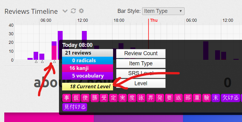
The review forecast does just what it claims: it shows when new reviews will show up, broken down by the day and then the hour in a simple, easy-to-scan format. It shows new things being added to your queue without any predictions — it’s a forecast of what happens if you don’t do anything. After you do reviews and come back to the dashboard, the forecast changes to reflect the availability of all the items you just reviewed.
The illustrated lesson and review buttons are, well, buttons that, uh, have illustrations. Since those two things are what everybody should be doing on WaniKani, we’re calling them out front and center. As the counts change, so do the illustrations.
We took away a couple things to make room for all this: the “available now”, “next hour” and “next day” sections up top. The buttons and the forecast cover the information those sections delivered.
So, give it a whirl and, once more, share what you think. We probably won’t re-invent the sections, but we’re open to feedback for future tweaks and improvements. Thanks in advance for the time and considered feedback!
I like the move of the review forecast chart up into that empty space that was there before! It really puts a balance to the main page that is calming for me . I’m also warming up to it despite being so stubborn earlier about Ultimate Timeline, especially as now I don’t have to scroll down to see the day’s schedule.
A few things I would tweak, however:
Have some sort of bar color change or badge or something (could just be something as simple as a tick mark or dot) to show at what time a level-up review is coming. As the new review forecast doesn’t have mouse-over item viewing capabilities, this would be helpful for me for planning my review day
Larger numbers on the lessons and review buttons (right now they’re kinda small and not the focus of the buttons, and while the illustrations are cute maybe find a balance between the two?)
I really am coming to like the new setup though! I appreciate WK’s drive to constantly be improving, and I know there’s a lot of information to juggle on the main page. Thanks for the continued hard work and I’m looking forward to the progress in the future!
Due to the comically-oversized lesson/review buttons, and the removal of the next review box, it takes way more work to see the information I care about.
There just doesn’t seem to be any upside for me, and plenty of downside that will be frustrating several times per day.
The forecasting may be nice to have.
The illustrated buttons take up way too much real estate. I’ll get used to it, but to have so much space taken up by what is essentially two numbers is a little frustrating at the moment.
Is there an official wanikani app? I’ve looked and wasn’t ever able to find one.
On the topic of changes, i love the review forecast, but i think it could be a little more clear what those numbers mean.
It’s kind of a big jumble of numbers and its hard to decipher the information in them (kind of like looking at a big, unformatted Excel spreadsheet - bleh!)
I also think the buttons take up WAY too much real estate. Sure, they’re important and I’m glad they’re more prominent, but they shouldnt take up my whole screen.
I also would appreciate if the forecast was above the current level status. Having to scroll all the way past that to see my upcoming reviews is a little tedious, and I feel like forecast is much more relevant in most situations.
Have you ever thought about making these features customizable? That would solve a lot of user complaints. It doesn’t seem like a very difficult thing to do, especially since the dashboard is such a vital piece of the user interface.
As someone who enjoys the challenge of learning kanjis, I feel the need to see how many kanjis I can lose this level while still proceeding ASAP and don’t break my schedule at the same time.
I have a FT job - the schedule matters.
I use ultimate timeline for tracking my critical reviews. I want to keep my pace high and see where I can postpone review if I would really need to miss it, except for critical ones, which affect my schedule.
I see the development in the right direction, but the outcome is 0 for me.
Sorry for such a feedback.
I enjoy your service very much and happy to pay for it.
PS: if somebody is interested, I’ve found my schedule very comfortable:
level-ups on Saturday mornings (8:00, 12:00, 20:00) - keeps my Fri+weekend evenings free for socializing,
new kanjis on Tuesday night (20:00, 00:00) - the night I’m least likely to have drinks.
Love it
New buttons are a little large for me, but that’s a matter of getting used to, I think. I like the overall look and it’s fun that the button animations change depending on the number of items you have in the queue. Review forecast looks awesome!
This update also requires changes to the Dashboard Level Progress Detail script. See my post in that thread:
Honestly was not a big fan of the update
I get the notion of making huge buttons so that people press them, that’s pretty good
But the review forecasting is just bad compared to the Ultimate Timeline
And that’s the most important thing that I want to see: how many reviews I have and how many are coming.
PS: Also will have to find new home for the little images I put up for myself