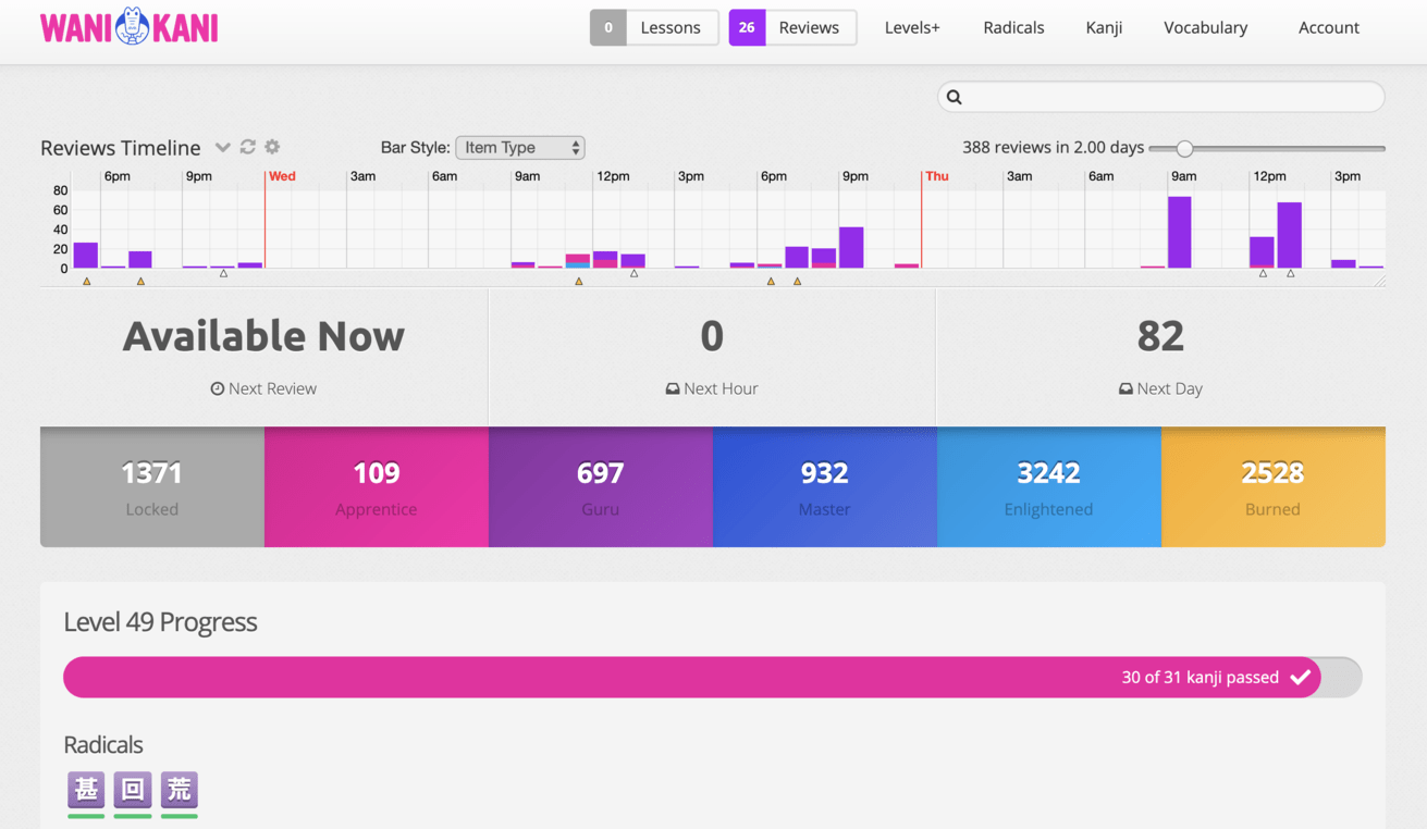
Even on desktop those huge lesson and review buttons will be hiding a lot of important information that I can see right when I go to wanikani atm. I like being able to see my apprentice/guru/etc numbers without scrolling down. Ultimate timeline is far better than forecast and I can choose from hours to 2 weeks down the line. I prefer it as it is and I hope we will get the option to remain the same.
The only plus here is that it since it looks flashier it will probably appeal to new users. As a non new user theres nothing I would take from it into my current dashboard:
This update addresses no pressing need I can see. I do find this it well-intentioned, but cluttered and ugly. Having giant buttons I can press with my fist doesn’t balance with the delicate dropdown spreadsheet on the right showing upcoming reviews, if I click and dig out my magnifying glass. The current dashboard-- which you unveiled a couple of months ago?-- works just fine, with an elegant, clear design. But now that I’m used to it, I will have to adjust again.
Besides,have you all never read Tufte?
The ultimate timeline stuff, at least in my layout, is below the fold. It’s not something you have to check over and over again. Another parent in the thread mentioned scheduling-- I care full-time for my infant in addition to freelancing. So I don’t want to think when I use this app. I want to glance and know when the next batch is up so I can file it away in my brain and get to it then if I can. This next-reviews thing is more clicking and thinking, adding to a cognitive load and reducing the usefulness of an app whose whole point is to take out much of the drudgery of making flashcards and scheduling. I’m not sure how a user-centered design process would arrive at this, especially since I’m not sure how you’re collecting user feedback.
Basically, my thought is: Less is more, more’s a chore.
I’ve been using the preview since the update was announced and I absolutely love it. I do most of my reviews at work and I can’t install scripts so this helps me see what my review schedule is going to look like and helps me plan how to integrate reviews with work.
It’s a step in the right direction and I like the cute pictures.
But one thing I like about ultimate timeline is I can view my upcoming reviews by SRS level, and level so I can see when important reviews are coming up. It helps me stay motivated knowing I’ll probably guru some important kanji in the next hour. I understand the push for a cleaner format but for me the benefits lie in the details.
Thoughts (desktop user):
-I like the look of the new buttons, although I agree with the above that the numbers could be bigger.
-Still miss being able to see my level without having to click on the level button. I didn’t even realize I’d leveled up until I got my Koichi email.
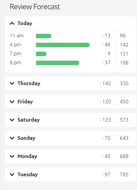
-I actually do like some things things about Forecast better than Ultimate Timeline - it tells me exactly when the new reviews will be w/o me having to count all the bars or scroll over the sometimes-tiny bars to figure out the number/time. However, as many people have mentioned, being able to see the SRS level/type of reviews that are coming up makes Ultimate Timeline still more useful, imo. I think that the new Forecast is trying to preserve some of the surprise of what is coming up in reviews to check that you really know them, which I appreciate, but these other details could be added w/o having to show exactly which items are coming up. Plus, having it vertical makes the screen more crowded, I think.
-Still digging the new progress bar/item progress, although I think it looks better when it’s not constrained by the forecast bar.
-New SRS level totals boxes look nice, and I personally don’t mind them getting pushed down the dashboard b/c those are less important for me (although I’m no speed leveler).
Overall, I like the changes (personally, I’ve never been a huge fan of the big “Next Available/Next Hour/Next Day” bar, especially since the Next Day bar doesn’t give many details), but I do think the forecast bar could use some tweaking before it’s fully released.
wait a minute. So the super useful “wanikani ultimate timeline” would not be neccessary anymore?
anyway the change is good imo
edit: a bit late for the party but this timeline is a bit hmm strange to look at first. So based from what I figured out this means that if I don’t do any reviews today, then tomorrow total reviews would be 330?
i have a suggestion, create spoken audio clips for the example sentences so we can practice not only writing the sentences but making sure we are not mistaking the way they are pronounced… it would make wanikani %50 more useful imo
Love the review forecast widget. It looks even neater than Ultimate Timeline, though a type breakdown in the progress bar colors and/or review details on hover would be nice.
The giant buttons I’m not a fan of. I do think making them more prominent than the current live version is reasonable, but this is a bit too far. The giant bright pink blob burns my eyes, the most important part (the numbers) are barely visible, and the illustration is uninformative, and frankly even knowing what I am looking for I have trouble seeing the crabigator, and I don’t even know what the creature on the reviews button is (bird? egg? kappa?).
I also wish the Apprentice/Guru/etc. item totals weren’t pushed below the fold.
I’ve been using wanikani for years now here’s some feedback:
The site has become more cluttered with a lot of statistics and by and large needless information. I understand that some people are very interested in seeing the data, but it would really be better put on a separate page. I must say it makes the dashboard look like a complete mess. Others have remarked, the new buttons are comically large. I still use Wanikani because of its content and SRS system. However, a lot of these updates (theme colors going from purple to white and hot pink especially… ) have really made using the site a whole lot less enjoyable.
So, I just want to say I actually prefer the new forecast to Ultimate Timeline. It provides the most important information more easily, I think, and keeps it in a more appropriate spot. This is coming from someone who has been using UT for over a year and loved it.
I do share the sentiment that others have shared, it would be a huge improvement to have reviews marked if they contain current-level kanji required for level-up, and if we could see the SRS breakdown within each bar. Those were 2 features I used religiously on UT that while I don’t think are crucial, are certainly very helpful.
Keep up the great work! Love that you guys are still working to improve the system.
Hate it…why not just work with the ultimate timeline? That script is simple, clean takes up very little space and with one slider… it clearly shows EVERYTHING you want and hovering you can get all the review information you want and can quickly sort by item/srs/level. The same level of detail is in the flaming durtles app as well…why do people keep trying to build a better mouse trap when this one works extremely well…ugh
The new timeline is clunky requires multiple clicks to do the same thing and doesn’t come close to providing the level of detail the UT script does. The bar charts are simple and fast on the UT script. But for this new one you have to scroll down and it’s a window in a window which is just extra annoying. Then you have to open each day to see the reviews, but oh yeah you have to scroll in the window again…oh look no way to see the whole timeline at once…again the UT script does this flawlessly and I can see 10 days with that script with a SINGLE click. No need for scrolling around or trying to sift through a window in a window…seems like a programmers interface with very little consideration to the end user getting the info quickly and simply.
And obviously we must have these ginormous buttons for lessons/reviews…I mean really? In some ways the new interface is worse, still the stupid squares and now this…come on designers…think about ergonomics and actual usability…and if that isn’t going to happen then how about some SRS improvements like dynamic srs/ghost reviews/leech fixes…real learning improvements, not making the ui worse
I love it! I remember during the earlier pre-announcement that you couldn’t collapse/expand the days in the Review Forecast on the desktop version, but that’s been changed now So there’s nothing I would change! Love the pictures.