Thanks for that - sometimes you get tunnel visioned when looking stuff up!
大変ね。。。ちょっと心配します。まあ、多分 (EDIT: たいてい) 全部大丈夫。
Oh no… 霊様 would be terrified…
I have occasionally used NHK News Web Easy for reading practice, but I haven’t visited the site recently - until this afternoon.
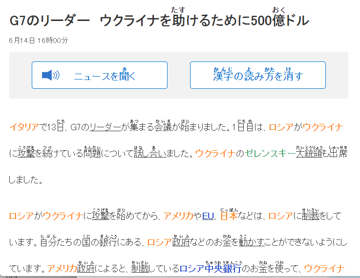
What I noticed was that the font used within the articles is so thin and stick-like that I’m having a hard time reading it.
I’m unsure of whether that is typical of the site or whether, for whatever reason, the font that my browser (Brave, on Windows 11) is presenting it in is a poor choice. The headline font is great, but the article font, no so much.
Here’s an example screen capture (from G7のリーダー ウクライナを助けるために500億ドル | NEWS WEB EASY):
Just checked it in the Edge browser on the same PC, and the weight of the characters looks heavier in Edge - so maybe there is a setting in Brave that I have somehow missed that I could tweak to improve the readability there.
From Edge:
Both browser windows are approximately the same size, and both have the magnification level set to 100% - but it looks like Brave is squeezing more characters into a line than Edge is.
Again, perhaps that means that there is some browser setting or font choice that is tweaked better for readability on Edge.
I’m wondering how what I’m seeing on my screen compares with what others are seeing.
(I have not captured the entire screen, rather just the part containing the article text - there is a right sidebar visible in both browsers that I did not capture in the screen shot.)
Also note that the two browsers differ in the “decorations” used in their windows, for example with Edge having its own right sidebar that is effectively reducing the available screen ‘real estate’ for rendering the web site compared with Brave.
I have that same problem on Windows/Edge at work, but not at home with Mac/Firefox. I don’t know if it’s the browser or the installed system fonts, or what the deal is, but I’ve seen it too.
Screen shot from home, to compare what I think is perfectly legible:
I can go in the developer tools to edit the stylesheet and add font-weight: bold, but that’s too much hassle to be worth doing every time.
These are the fonts it’s trying to use
font-family: “Hiragino Kaku Gothic ProN”,“ヒラギノ角ゴ ProN W3”,“Hiragino Sans”,“ヒラギノ角ゴシック”,“メイリオ”,“Meiryo”,“MS Pゴシック”,“MS PGothic”,sans-serif;
Your screenshot is indeed very readable.
I will have to take a look at the inspector in Brave and in Edge.
Frankly when I read NHK Easy I use an android app called Sync for NHK Easy because it does a bunch of useful stuff that makes it a lot easier to parse for me (including optional furigana, tap definitions etcs)
I had a similar problem on Windows 11: for some reason the browsers ignored my font preference (Noto Sans) unless I configured them to override sites font preferences globally.
Which was undesireable, because for non-Japanese sites I prefer to let them choose their own fonts.
My workaround was to add a custom filter in uBlock Origin:
www3.nhk.or.jp##*:style(font-family: "Noto Sans JP" !important; src: local(Noto Sans JP) !important;)
(same for Watanoc - I may add others in the future)
Funny thing is, at least with Noto it makes characters slightly thicker but at the same time also more compact somehow, see the first line in the screenshots below ![]()
That said, I find I do need to use a 110% zoom for NHK Easy - the furigana ends up being too small for my liking, whereas with other sites I may even go to 90% ![]()
— with uBlock filter
— without uBlock filter


