It’s not about if newer users have the patience to wait; if that was the issue you would see more posts complaining about the fact they have to wait. That is where there is much more validity in just blaming them.
Since there doesn’t seem to be any disagreement that the issue exists, I would prefer focusing on what ideas we can come up with that might solve the issue, rather than attempting to determine who’s fault it is.
As I mentioned earlier, I’m suggesting since the users appear to be missing one very specific piece of information, despite being given it through more than one method already, if we could call out this information more directly it might help solve this issue. Since the forum is where all of these questions are raised, I considered the idea of trying to display a message when the user joins the forum about this specific issue which would redirect to the Guide. If not that, possibly a banner message with that specific question pointed out.
I also liked the idea to have the ability to replay the tutorial during the first few levels, especially when there is a high chance of first-time users not using WK that much right away, but possibly coming back later after a long period of time when they wouldn’t remember anything that would be shown in the tutorial.
I think what they want to say is that using the text book gets easier [because they have Japanese text you need to read], not that looking up grammar points that interest you is forbidden [why would you need kanji for that?]. “I tend to recommend” is not really a strong statement, maybe level 5 is the absolute lower bound, 10 good, 20 better, level 0 is OK anyway?
They also mention na-adjective, noun, etc. The intention is that you have a rough idea what for example an adjective is, later see it in the text book, and afterwards revisit the words to see what they really are.
But you could add something, why not. What would you put? “Ichidan/godan are verb classes that conjugate differently”? Or a longer explanation?
Sorry, I probably meant EtoEto, I never really looked at both [But I hope TextFugu is able to tell you what ichidan/godan is …] Anyway, what I wanted to say is that separating grammar and kanji is a good idea.
Here is a good example post from when I asked in this thread if they had seen the guide, FAQ, or tour. This is one of the scenarios that is pretty common and is the reason why I think having a one-time tutorial at the beginning may not be enough if users aren’t going to use the site seriously right away. It’s a good example of why we shouldn’t just write it off as people being stupid.
This post by @koichi actually sounded like a reasonable idea, although I’m not sure something like this would be possible. I do think that something that something that is front-and-center would be the best. We need something that could quickly get out of the way for active users, but that might come back for users who sign up, but don’t use the site until after a long time. Ironically, SRS might be the solution to that.
I think the idea proposed here is complementary and even better than the tour. As a new user I did see the tour and read it but it was a close call. I could have went through it without any remorse. Why? Because anyone using internet/apps often is used to see tour pop up and 99% of the time, it’s things you can figure on your own in less than thirty seconds. You don’t want to bother with a tour that is 10 years late in terms of UI.
Speaking of users who don’t read… (see first post), but yes that’s one of the ideas we’ve been talking about.
As @Welteam said, there is the automatic temptation to ignore a lot of tutorials, partially because they’re often explaining things that should be obvious. I generally stick by the idea that if you need a tutorial, you probably have a design problem. In this case a tutorial is necessary because many users won’t know how an SRS works, but if that isn’t enough they probably have a design problem.
The only concern I have with a banner is
Will users notice that even? I can’t honestly say I personally pay all that much attention to banners. They blend in with the header a lot and are easily ignored, because they often contain information that’s not that important.
Will the banner be closable? If so will it be closed before the user reads it, just on instinct, or will it stay open all the time and be something users want to close once they have read everything it links to?
A banner is one option, but I feel like we can do better. I’m liking @koichi’s suggestion of something included in the reviews themselves. Maybe it doesn’t have to be an actual part of the SRS, but once you finish your reviews, there could be a message on that screen about what to do next that links to the guide / FAQ.
I also suggested something on the forum when a user creates a new account. Maybe they have to read the guide / FAQ before they use the forum, since that’s where they’re going to ask the questions. Maybe there can be a sticky thread that says “READ THIS FIRST.” I’m throwing out a bunch of ideas here, but I think we need something that users can’t miss. Maybe multiple things, but it’s clear that what exists now is either not being read, or being read and forgotten by a large number of people.
I think you guys are over complicating this. This message would appear during the entire time the user is at level 1. This way you can guarantee that the message gets delivered. A user could create an account and only come back 2 years later. The message would still be there. You could even add the message during x time, in case the user hasn’t logged in in y time.
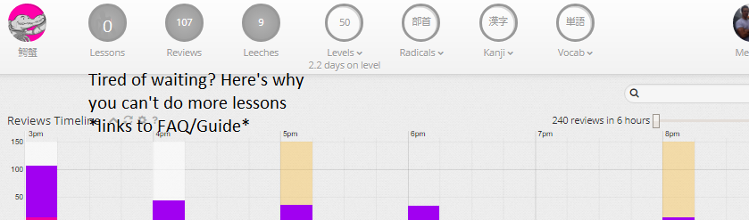
The message would appear the moment you move the mouse to the lesson’s button. You could even turn the 0 into “Click me”. People skip FAQs/Guides because they think it’s unnecessary work. The trick to make people take action is to create them a new problem: “not having lessons”. You’ll only care about taking “Vitamin GdgJGdasb” after seeing it being advertised on TV saying that if you take it, you’ll sleep like an angel.
EDIT: Sure, you can probably do better. But this takes like what, 2h to create? Idk anything about coding, but it seems something relatively simple. If WK keeps trying to make every single thing perfect, then WK will only be a “finished product” in 20 years’ time. By then, it will be obsolete.
And to add to your idea, I would add a thing to incentivize reading the FAQ and Guide. Perhaps a quiz that keeps appearing before reviews to make sure the user understands.
“How to loose all your customers 1.0”
No seriously, we aren’t here to annoy newcomers but to guide them.
And I think we could just have the same banner as free accounts :
For the link, I tried both. Nevermind, I sent it from my computer.
As for your argument, it misses the point. The problem is that someone who bothered to go through the FAQ and the Tour don’t want the site to further bother him because some members don’t.
And you won’t ever gain anything from risking to loose potential customer because you assume they won’t buy.