The new fonts look fine to me. Gotta get used to variation eventually.
8 Likes
2024-02-15T01:22:00Z
| Edition | Windows 10 Home |
|---|---|
| Version | 22H2 |
| OS build | 19045.3930 |
| Experience | Windows Feature Experience Pack 1000.19053.1000.0 |
Google Chrome: Version 121.0.6167.184 (Official Build) (64-bit)
I also have Google Japanese Input installed if that makes a difference.
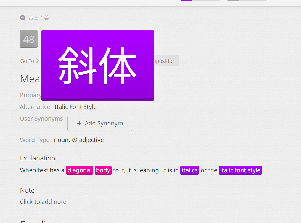
I’m confused at what is ridiculous exactly. It’s common for kanji in big font to look like this ?
Here is a screenshot of the front page of today mainichi shinbun. Take a look at the 大 near the end:

5 Likes
No strong opinion on the change, though in general I like the move away from Google. I can’t speak to the differences in accessibility between the old font and the new one, either; to my eye, the fonts look very similar, even though the weight is slightly different.
This change inspired me to go ahead and install the jitai font randomizer userscript, and man, does it make my reviews take longer! But I think it’s really neat and I would love to see something like that integrated into WK proper, maybe as an optional setting, since I can see how making it default could create accessibility issues and make the learning curve way too steep for brand new users.
1 Like
These look centered?
Am I missing something? What is different? Everything looks the same? People are talking about how they can’t read the fonts they are so thin. I just can’t see that. When you click on the kanji or vocab they are pretty dang bold to me? Am I crazy?
4 Likes
No, no, you are quite sane. The font change went through several changes since it has been announced.
2 Likes
I absolutely love the new font. Can’t say the same for many of the updates since I joined, so I’m very happy to be able to praise something.
2 Likes
It’s interesting, the radicals that aren’t centered sit to the left where most of them (tsunami, soul, animal and fingers) sit there exclusively in the kanji they’re part of, so I think it would make sense to leave them not centered. The Stick and Barb radicals are centered, just like they sit in the middle of the kanji they build.
3 Likes
It’s because your screen is so tiny, but it’s also something they can fix (it’s a CSS flexbox issue). They need to add width: 0 to .extra-study-button__link, since it’s set to flex: 1 0 auto. This will allow the text to wrap on small screens, rather than crushing the item next to it.
Proof:

vs

I also set the line-height to 1.125 since 1 is too small.
2 Likes
I legitimately thought this was on purpose to begin with
1 Like
Yeah, if you weren’t familiar with the way it was it would totally make sense. Those radicals were centered before, and some of the characters were images and not fonts. Now they finally look unified.
I’d suggest that anyone feeling that things don’t look right do a force-reload holding Shift (e.g. Shift-click, Shift-Ctrl-R, Shift-⌘-R, etc.), clear cache for the site, and/or try another browser to see if that makes a difference.
Not to discount any of the concerns people are raising, but a lot of what I’m seeing in this thread suggests that many people are simply not seeing the same/correct thing in the first place: screenshots that don’t match each other, seemingly different fonts/weights in different places on the page, even right next to each other in the same word in at least one case, which isn’t normal and seems indiciative of a local issue – also potentially something else with rendering in the browser or display settings (i.e. non-native resolution/scaling). Better to be sure!
2 Likes
That’s because you’re late to the thread! The fonts and layouts have been adjusted a lot throughout this thread so people showing different things are doing so because those different things were all official releases. It’s not due to a caching issue or anybody misunderstanding.
1 Like
I’m not picking on you @Cookie316 but I have seen this statement about multiple updates during this thread which has me confused. I have only made one update so far where I changed the original font weight from 300 (which people said was too thin) to 400 which people have said was too thick.
Am I misunderstanding what others are saying when they say there have been multiple updates?
1 Like
Nope, “multiple updates” is referring to the initial one plus the later one. New people coming in assume it was just one update and get confused by the earlier comments complaining about what they percieve to be a non-issue. So the “multiple updates” is clarifying that the initial complaints were about a previous version pre-update and that’s why they no longer seem relevant.
And don’t worry I don’t feel picked on whatsoever. It’s all good.
3 Likes
@Cookie316 : I saw people posting about the issues I mentioned after @tofugu-scott already said an update had been deployed, hence my comments about potential local issues, for those still seeing inconsistency. It never hurts to check. ![]()
3 Likes
I wish custom font selection was built into the website instead of having to use scripts and other work arounds though.
Personally, I love the UD Digi Kyokasho Font and override the website font anyway. It’s more natural looking and easy on the eyes IMO. I think it’s helped my recognition some when I’m reading texts. In fact, I made UD Digi my default Japanese text font in Microsoft Word and OneNote.
But, anything is better than Mincho. For some reason, I can’t stand that font.
UD Digi Kyokasho was designed for easy readability

Noto Sans JP is part of Google’s full Noto Sans library of fonts

FG Kyokasho is similar to what Japanese dictionaries use.

MS Mincho is ugly
Klee One is supposed to emulate a clean handwritten style

And if you’re a real masochist:
HGP Gyoshotai

13 Likes
The fonts are way too thick now; my brain is having a hard time “seeing” them properly. I’m getting close to level 60, so a change this big right now is REALLY frustrating because at the moment I feel like I can’t use WaniKani at all.