Issues with the new UI for Level, Kanji, Radical, Vocab Pages

While I appreciate how hard the team has worked on this UI update, I think that the new UI for the page for each level, as well as the page for each character, vocab, and radical is clearly a step in the wrong direction.

Here is a side by side of new vs. old, and where I think things went wrong:

On the old version:

–The contiguous blocks of color highlight the large white characters.

–The primary visual emphasis was on the strokes of the characters, with a much diminished emphasis on the readings and meanings. This had the advantage that you could read the characters very easily and quiz yourself informally because the readings/meanings were so much smaller.

On the new version:

–The primary visual emphasis is on the little colored squares bounding the radicals, kanji, and vocab. Immediately when I look at this page, I see blocks of colors, NOT characters. This seriously diminishes the usefulness of the page.

–The characters are tiny!! We shouldn’t have to zoom in all the way just to see the very thing we’re supposed to be learning!!

–Second, as someone else here has pointed out, equal visual emphasis is given to the character forms and the readings/meanings, making it nearly impossible to quiz yourself informally on the pages for each level.

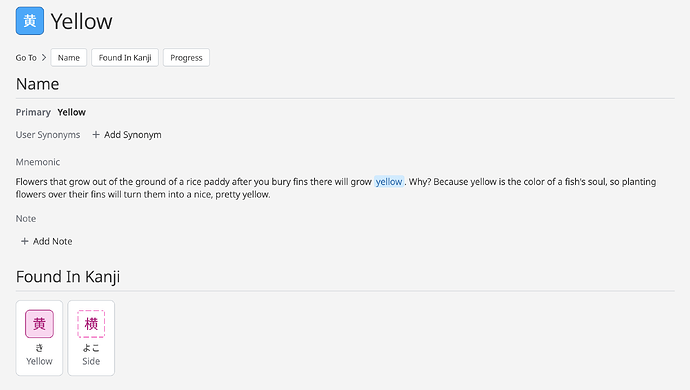
On the old version:

–The heading character was somewhat small. Not ideal, but not too bad.

–The “found in kanji” was nice and big. Important info, and there’s strong visual contrast allowing us to see the characters.

In the new version:

–The header character is EVEN SMALLER. And it is very small in its bounding box, drawing more attention to the little blue block of color than to the character that I’m supposed to be learning.

–Even worse, the “found in characters” are tiny

–In “found in characters”, more visual emphasis is given to whether I’ve unlocked the character than to the form of the character. Big step back!

-–

I’m glad that people are enjoying the customization of the dashboard, but the changes to the heart of the program, the pages for each level and character have taken a few big step backs in my estimation. At a bare minimum, I hope that we’re given some choice to revert our display back to the old version. These pages were essentially perfect and there was no need to change. I really prefer to stay on WaniKani than having to look elsewhere for learning kanji.

Thanks for your consideration. This is my first time posting here, and I wish it were for a happier reason.

66 Likes

I agree with this. :folded_hands:t2:

Big thanks to the team for all the hard work. You all truly go above and beyond. It would be nice to be able to make the kanji bigger to see the strokes more clearly. :slight_smile:

13 Likes

Thanks for making this - we’ve gotten a few pieces of feedback on this today. We hear you!

25 Likes

I completely agree with you.

Also, another thing that bother me a bit is the new highlight of radical and kanji in mnemonics. Like just having the word ‘yellow’ highlighted doesn’t feel the same as the block.

10 Likes

Thank you. You did essentially the same thing I did (post in the forum for the first time to say what’s wrong with the dashboard) but in a much better way. I’m glad people are talking about this.

7 Likes

+1
Instead of investing into UI, I’d rather want them to fix some not-intuitive mnemonic stories. Or add a mechanism that allow you to learn the kanji if you already know all required radicals, instead of waiting for specific level…

4 Likes

I’ll just add that if we’re not allowed to go back to the old layout, I won’t be resubbing my yearly plan. I know I’m just only one person here but perhaps there are others who feel the same way.

4 Likes

I made a similar plea to bring back the big kanji in the main dashboard thread. Hopefully it’s a quick fix on the backend.

3 Likes

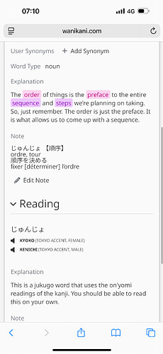
Could you please show the line breaks for the notes again?

Please. It is very hard to read now.

Thanks!

4 Likes

This post sums up perfectly every issue I have with the new UI as well. For long term users it’s gonna be a rough transition getting used to this new UI.

9 Likes

My time to resub is coming soon in December. I’ll definitely be reconsidering resubbing if nothing changes. Would love to resub though.

3 Likes

Same. I’m seriously considering unsubscribing and trying out something else. I’ll hold out just for a little longer to see if they change back to how it used to be. I use Wani Kani as a dictionary too, and the UI changes are such a shocking and wasteful step backward.

4 Likes

Nicely layed out the most important problems with this new design.

2 Likes

Thank you for posting! You said everything I’ve wanted to say, but far more articulately. I have, let’s say, mixed feelings about the new dashboard. There are small issues I have, but there are also improvements. I can live with it, and I’d imagine even learn to like it.

But these pages are just (I’m sorry, and I realize that there are live, hard-working people here) a design disaster. LIke you, I’m starting - and I can’t believe I’m saying this - to look for another way to study kanji. Sounds extreme, but this is an eyestrain, and far too difficult. I hate feeling this way; there is so much I love about this program.

I do feel like we are being heard and they are taking this issue seriously? And it is, or should be, a very easy fix - they simply don’t need all that white space on the page. The size the character becomes when you hover over it? That should be the minimum for the default size; I’d welcome it to be even bigger. Fingers crossed they do address this.

Thanks again! Hopefully the next time we write it will be in a happier vein.

7 Likes

I can only guess this has been brought up in the main “The New Dashboard is Here” thread.

I’m hoping that our “feedback” doesn’t fall on deaf ears.

Out of curiosity, do the developers actually listen and take our feedback/suggestions on board and implement it?

2 Likes

I may be mistaken, but it seems that in the previous version, the “kanji reading” referred to the on’yomi reading. After the update, it appears to be the opposite.

I believe that this change preceded the UI update. I saw this onyomi to kunyomi change for “south” about a day before or so. “Southeast” was also moved up a few levels.

At the time that I made this post, nearly all of the replies to the “New Dashboard is Here” thread concerned only the main dashboard. So it seemed fitting to make a separate thread to highlight some of the issues with the rest of the UI update. I’m very pleased that users have been recently posting similar concerns about the vocab/kanji/radical pages in the “New Dashboard is Here” thread.

I do believe that the Wanikani HQ people are aware of this particular thread, as Tofugu Kyle responded previously here. Whether they’ll act on any of this…who knows…

3 Likes

“If it ain’t broke, don’t fix it”

6 Likes

Huge +1 to:

  • bigger characters
  • having lists instead of grids
8 Likes