This is honestly amazing! ![]() Especially the orange number on the reviews is such a cool idea! Thanks for making all the effort!
Especially the orange number on the reviews is such a cool idea! Thanks for making all the effort! ![]()
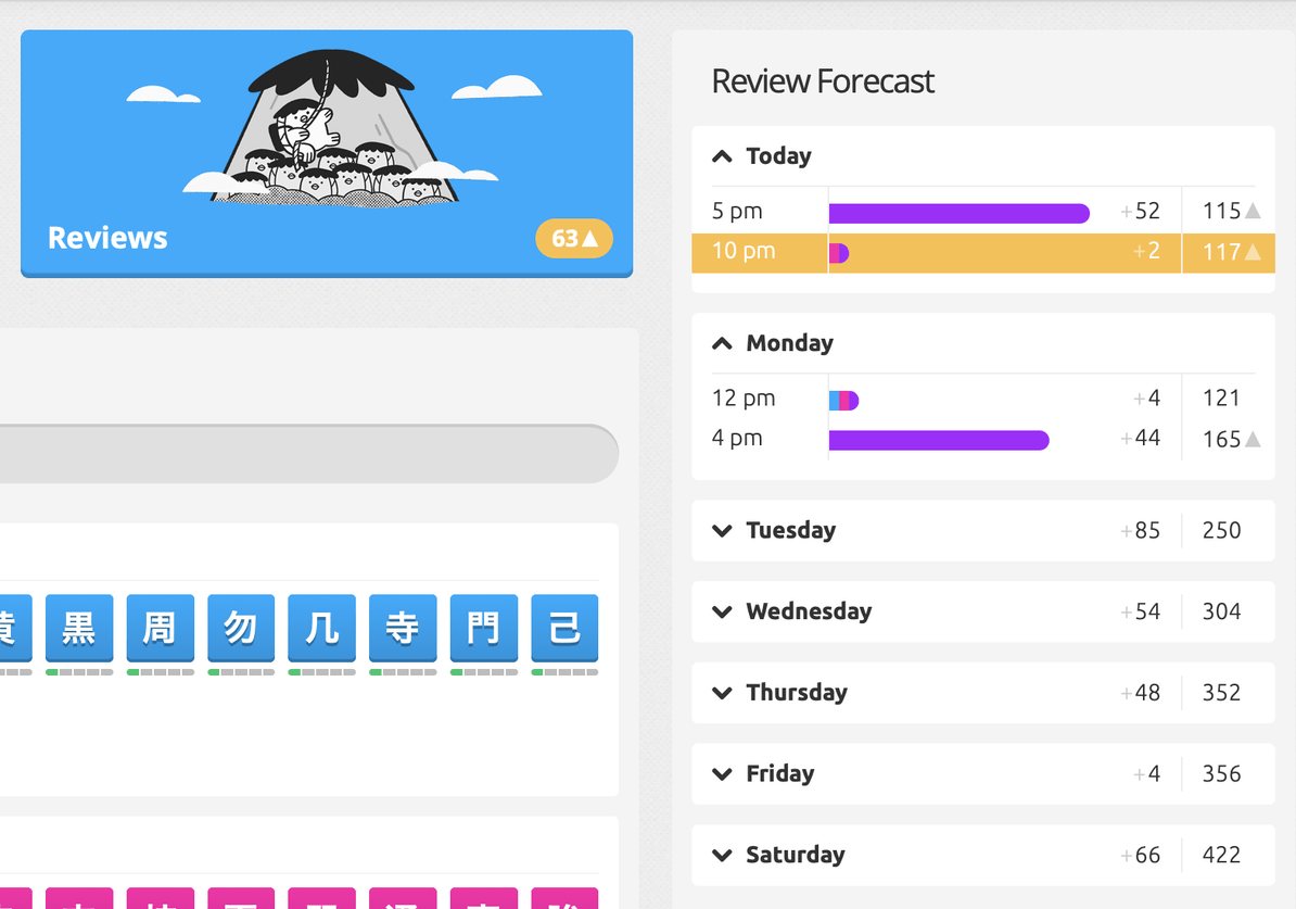
Ah, nice catch, @rever4217! I suspect that in your case, as in mine (oops!), the hills radical was being counted. We learned that somewhere around level 4 or so, but it was moved to level 29 in the meantime… so it shows up in the API call as available for review, but unlike the native interface, I didn’t do any level checks. Fixed in v1.4.1, thank you for the report!
@postliminal, glad to be of service! I like the challenge, and I really like how it turned out in this iteration. Thank you for the inspiration!
2 Likes
I see, thanks for your updates!
Two super minor things I saw just now:
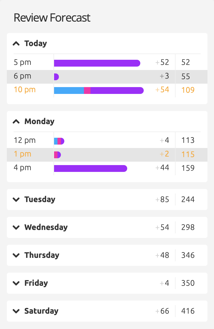
- The orange color continues to the bottom of the table.
- The orange is almost the same as the burned item color. Maybe then it could be the same?

The native burn colour is actually dark gray, but I suppose I could use green for critical, orange for burn, for all those who use the golden burns style?
The end of list spacing issue I’m aware of, but I’m not a fan of fiddling with CSS… if you’re willing to supply the CSS tweaks, I’ll happily incorporate them. ![]()
1 Like
Sure, I’m happy to contribute, I love doing this kind of stuff hehe.
Not an expert though. ![]()
I tried to make it as short as possible:
- The burn color from the other script:
#fbc042 - The normal green level color:
#59c274 - The css fix for the correct padding at the bottom:
'.review-forecast__day.mb-3 { padding-bottom: 12px; }'+
'.review-forecast__day.mb-3.is-collapsed { padding-bottom: 0; }'+
'.review-forecast__hour.pb-2 { padding-bottom: 0 !important; }'+
'.review-forecast__hour:last-child>* { padding-bottom: 0 !important; }'
Don’t know if this ! important is correct syntax, but it worked for me when I tried it out.
1 Like
Hi! I love this script, and like the new changes that show the composition of the upcoming reviews – but the blue/pink/purple colours over the golden critical background kind of makes my eyes go cross-eyed ![]()
Could we have an option to tone down the critical background maybe?
2 Likes
I think using the a bit brighter color from the burn script would already make it more readable.
Or could just coloring the text be an alternative?
(this is the normal, a little bit darker orange again btw)
Just some inspiration hehe. ![]()


Edit:
I played a bit around, this is what it would look like if you added the green as well:
(#59c274 for the green background, #08C66C for the green text-color)


1 Like
Thank you @skymaiden and @postliminal ! How would you feel about a toned-down version of the green criticals & golden burns? I think that’s a little less aggressive on the eyes.

2 Likes
In my opinion it doesn’t have to be toned down further. I would rather say that the green and orange at the same time is a bit much. Just the process bars together with the orange as a highlighter was really fitting in my opinion. Now there is another level of information by color code with the green and orange.
I am also wondering what would happen if you have critical items and burns at the same time. Would you have to decide if to color it green or orange? Also I guess the script was kind of meant to show a highlight for the burns as I understand it, so maybe it might be nice to still show the critical items, but to keep it a bit more low-key. So more celebrating / highlighting the burns. ![]()
One easy idea would be to add a small upwards-facing arrow at the end, just like the “+” before the new reviews, with a bit lower opacity. I think this would make it more readable, but also not too overloaded with colors.
What do you think about that? ![]()
<span class="opacity-25">▲</span>
.fcr_apprentice .opacity-25 { opacity: .5; }
.review-forecast__day .px-3 { padding-left: 10px; padding-right: 10px; }
1 Like
(You changed your avatar!)
This script was originally for highlighting level-critical reviews, and I think burn-level review highlights were quickly added too. I haven’t got any burn reviews yet (haven’t been on here long enough) – but I do have about 300 reviews a day, and I did like having the critical reviews visibly distinct from all the other normal ones…
The blue/pink/purple bars surrounded by orange is what is making it hard for me to see them properly… Too much visual “vibration” due to the intensity of the colours.
Maybe just a simple grey background or something like that would work better for critical reviews – tiny icons would be too small to see easily at a glance, and the legibility of white text over yellow background is already making me squint…
1 Like
(hahah yes ![]() )
)
Hmm maybe it would be good if you can select a priority. Highlighting critical reviews seems important for all of us lower levels, while burns might be more interesting in the higher levels, especially once you reach level 60 I guess. ![]()
I also like the idea with the gray, it seems to be more subtle.
Still the arrow is cute, isn’t it hehehe ![]()
Maybe then the last option would be the most readable?
Then the option could be that you decide if the grey background means critical items and the arrow means burns or the other way around.
Edit: You could also just have the Little triangles in orange to mark the burns.


Fantastic work! Thank you ![]()
1 Like
Updated with to v1.4.2 with adjusted styling. I’ve changed colours to green=critical, orange=burn, added icons as per @postliminal’s suggestion, and toned down the highlight opacity to keep @skymaiden’s eyes happy. Thank you both for your help and comments!
5 Likes
This is great! Thank you so much ![]()
1 Like
Benefits of levelling up: One tends to find bugs in one’s script. Version 1.4.4 fixes a bug where all Apprentice-level radicals and kanji triggered critical markup.
2 Likes
I would love if this script that a settings page where you could decide to turn on/off different features. For example, I’ve decided I do want to see when critical reviews happen (and I won’t mind the burn review ones), but I’m not interested in knowing what each review consists of (radical/kanji/vocab). It could also be cool to be able to turn on/off icons and the color highlight (so you can pick if you want one or the other, or both). There are also several other options that would be interesting.
For now, I’ll try to edit out what I don’t want, but it would be nicer if I could just tick some boxes. (Seems it might be a bit more complicated than I though…)
Thanks for the script!
3 Likes
Yeah, I’ll look into it.
1 Like
Cool, I did figure out what to edit out. But not the easiest if anyone feels similar to me. ![]()
If you feel like going back, I’ve added a bunch of settings now, accessible through the user menu. The settings allow you to individually toggle forecast and review button highlights and icons, change the icons to whatever you prefer, and you can have the bars vanilla, split into types, or split into SRS stage.
3 Likes