Thank you all for the feedback so far! We’re taking note of all of it and working on improvements.
Can you explain the reasoning behind removing the ENTER key for advancing from one item to the next?
That will really negatively impact my ability to use the site, as keyboard navigation is key to the way that I use the web site.
I was in the middle of a big review on my old mobile device when these changes went live and immediately noticed a difference! I thought, “Wow, did these get way easier to read all of sudden?” I suddenly found myself getting fewer kanji mixed up with similar looking kanji and can really see the radicals in the more complicated kanji now. I even noticed that I progressed more quickly than usual due to the keyboard changes! I used to always try to do reviews on a PC and dreaded using my phone unless it was necessary, but it might not be so bad going forward now. Thank you so much, Wanikani Team! ( ╹▽╹ )/
this update broke the Breeze dark skin for the site ![]() we really need an official dark mode at this point. all the websites have one nowadays.
we really need an official dark mode at this point. all the websites have one nowadays.
For more information related to user scripts, please see the dedicated post from a couple of weeks ago, which we created to give script authors advance warning.
Oof, really miss the Summary Page after reviews.
Where does it tell me how many items I got right/wrong by category and what my accuracy was after reviews? If you can point me to that then fine, but can’t see the logic in removing Summary Pages after reviews at all.
Also, as much as I like the new reveal under the item on an answer, I think you need to review the styling and font sizes. Take a look at this one I got wrong; I am looking for the correct meaning, but where is it? Oh the teeny tiny capitalised text - the layout is way off balance for showing the information:
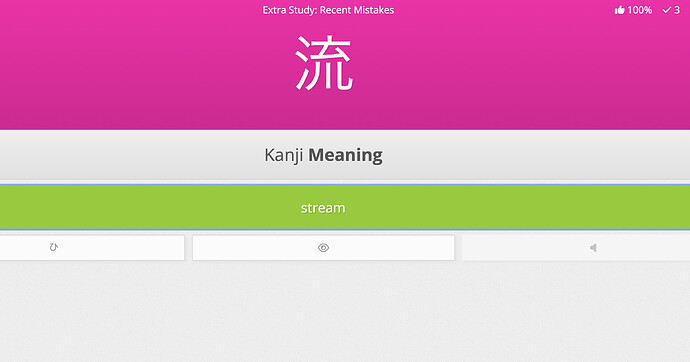
Lastly (and sorry for moaning so much) but generally speaking, although you have tried to improve readability I found that everything was much harder to read - in the reviews, the items text and the input text is smaller, but the question, headings, paraphernalia, seems over emphasised now. It’s super distracting. In this example, the “Kanji Meaning” seems over prominent compared to the reduced-size kanji font and reduced-size answer font:
The summary pages were an essential part of reviews: the immediate feedback was extremely motivating when I can only manage short sessions of review, and the level of success in each session helped identify patterns in my learning.
Plus the definitions are the absolute smallest text and incredibly difficult to see.
Seconding this!!
I have a very well-established workflow for doing WaniKani, which is heavily enhanced by scripts. Double check, lesson filter, and the keisei semantic-phonetic composition script are, in my opinion, absolutely essential enhancements. Especially since I’m so close to level 60, I’d really love the ability to just keep going with my current setup for at least a few months longer, even if it isn’t supported forever.
So mush is wrong now on mobile. Sorry for my bad English, but if you’d like to have some feedback from a mobile user, I’ll try to give some. ![]()
-
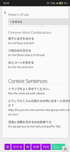
Before the update, all important info was nicely placed on the screen without the need to scroll anything. After the update, I have to scroll almost every card, especially where the context sentences now are. So, basically, I was able to click only one button, the arrow on the right side, to proceed, and now I need to both click the arrow and scroll and also swipe (see the next paragraph)
-
About the arrow: before the update, I could proceed to the next item (Kanji, vocab, etc) by the same arrow. Now I have to… Wait, swipe? I believe it’s a bad decision, since swiping often happens by accident and since I use swiping as gestures to control my phone. It also makes you think about doing a different action after you finished one item instead of automatically clicking the same arrow as usual.
-
I don’t like the increased font size, too, because of the same issue with scrolling.
-
The text in context sentences goes beyond the screen on the right side and crosses the border of the card itself. I believe this needs a fix, it’s an obvious bug.
-
Being able to select a particular part of the lesson (reading, meaning etc) right away was better than having to open the drop-down menu first. Imho.
And I also loved the summary page. I made screenshots of it as an achievement if I got everything 100%. ![]()
But it’s not that important.
I find the new green on completed slides harder to read and pops out in contrast with the slide colours. Maybe a colourblind option would be useful for those who had trouble reading it. I also enjoyed using the review page to look at what I’d failed.
Just tried lessons as well. (Chrome user - no user scripts). Wanikani keeps breaking and disconnecting every time I get something correct. Making me do all lessions in an endless loop.
Cannot do lessons nor reviews at all
Could you enable an opt-out for this please? It is pretty standard to have an opt-in or opt-out for sofware updates so we can at least roll back until issues are fixed.
Both double-check and back to back scripts are no longer working and the app completely fails so I can no longer review on my phone. As a lifetime member this is pretty disappointing.
Erm… what is it with IT designers making UIs always LESS informative and LESS usable.
UGH. These are the times at which I notice that I am getting old.
- Review summary: BRING IT BACK ASAP. This is valuable data for me, not to mention quite motivational when I score > 90%.

- Dark Mode, you spent all that time on a re-design and still can’t create a mode that doesn’t etch my retinas? Major fail in 2023. Naturally, user scripts all went ka-boom with the update and no clue when an update will be released.
- Mobile Layout on large screen desktop systems … yah… not going there.
Old fart would just continue to rant. :'D
Much preferred the the old UI. Wish there was an option to choose.
Thank you for the hard work! I especially appreciate the changes to mobile - it’s SO much easier to use now. Can’t believe I did like 120 reviews on mobile last night just before the new UI ![]()
Strongly agreed - with the exception of the synonyms in lessons, and the no-longer-disappearing keyboard on mobile, this update is primarily downgrades.
As a fellow developer, I totally understand what I assume was a desire/need to retool the UI for future development, but one of the biggest things that’s kept WaniKani head-and-shoulders above the competition was is its user experience. For the time being some of that advantage has just been shaved off, and it honestly scares me a little bit for the future. (A reaction I definitely hope is overly dramatic on my part ![]() )
)
WaniKani has always struck me as a platform all about slow, methodical improvements - be it through its learning philosophy, or the evolution of the platform as a whole. It’s something I respected a lot about you guys. Please don’t lose sight of what made you so awesome to begin with, in the name of progress. ![]()
The new interface looks great, but I miss the summaries. They were a great way to track progress and to know the status of each item.
I absolutely disagree… After having to do several different actions just to proceed, having glitches and out-of-the-screen text in context sentences I can’t see any reason for the new UI to be so much helpful for someone.
I like the changes overall - definitely feels more streamlined now.
However, I would urge you to reconsider the removal of the review summary.
I agree that displaying the summary of your last review before starting a new review is somewhat unnecessary, but I need the summary after my review to gauge how I did overall (big percentage) as well as to directly click on some of the failed items in order to review them - right then and there.
The latter part is very important in my opinion, as my memory of failing a particular item is still fresh and my mind is still malleable. I don’t necessarily want to review every failed item (i.e. using “recent mistakes”), but only the ones I “feel strongly about”. I think that hiding this behind more clicks, and possibly even the search function, shuts an important opportunity window for improving my mental connections for some particular item.
The summary page was an essential part of reviews, I can’t believe who thought getting rid of it was a good idea. Please fix this.
Also the black border around the input window when it is in focus looks absolutely horrible.


