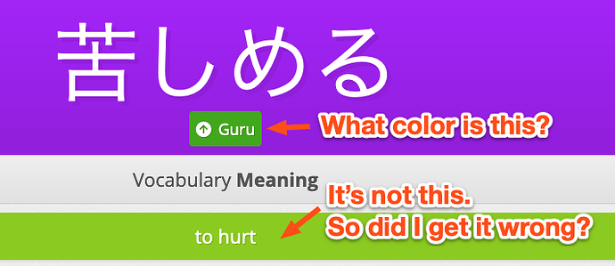
Just wanted to mention that as a color-blind person, I’m finding the new changes very difficult to parse. I can’t tell when I get something right or wrong. Furthermore, when it actually shows the up or down arrow (which is nice), the colors don’t match the rest of the UI. It’s really painful to do reviews right now ![]()
Likewise, when I get something wrong, I have to really search for what the right answer is. It used to be that it was right at the top. Now I have to really dig through the menus to figure out what’s happening. I don’t need the radicals or whatnot. Wish that information was below the actual answer.
Hopefully this can be improved soon. Thanks!
