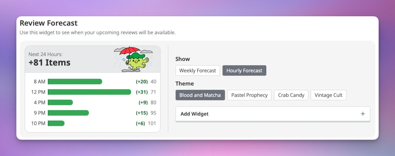
We went ahead and made this one expandy. So, instead of a scroll it will expand (vertically) as much as it needs to show all of your next 24 hours. A lot of the comments suggested that you want to see this stuff without having to click or scroll. So that’s what we did. Inevitably, the moment we make it so you don’t have to click or scroll, all the pro-click-and-scrollers will come out of the woodwork. If that’s you, please let us know. The vertical expandy-ness could get a bit tall if you, for example, have reviews every single hour (I pity you) for the next 24 hours. Hopefully this kind of thing is fairly rare, or at least just a temporary perfect storm type situation.
We’ll see how it goes, though. If you’re running into problems or overly tall widgets, too often, then we can look into some options. For now, though, I thought it better to just get this out so people can use it / we can get some feedback on it.
I also know that there have been requests for the current forecast widget with the next 24 hours just always expanded. Before you ask, that’s been noted. There are actually quite a few forecast related requests and ideas floating around that we’ve written down. But, this is probably the second most popular request regarding forecast after a 24 hour forecast widget.
Speaking of feedback: the list of feedback on the new dashboard widgets is about a mile (1.609km) long! Please direct any general feedback there, but do please leave your 24 forecast widget feedback and commentary here.
Goddamit. I really didnt want to be that guy (since I posted so much already). But I guess I am that guy. I do reviews at random hours all day long (see image), so scroll gang could need a lil help on this one. For now, it will do . Having both options could be nice!
Great idea, thanks!
One comment on the widget: The text on top of both widgets gets very visibly repetitive. What could be the solution for this ?
Nooooo, I figured that would happen. I think I’ll suggest adding a scroll vs expand option people can select. If we do it one way or the other, the anti-scrollers or the pro-expanders will all come out of the woodwork, depending on what we do. So, “Porque no los dos?” I suppose.
Ah yeah, that was another thing we were like “it’s going to be the same header but… we’ll get that fixed later and push this out now.”
I am not sure how to fix it, either
One other suggestion was to do a countdown timer to the next review, though that’s more of an option than something we’d want to hard code in.
Could use some ideas here, people Help me do my job so I don’t have to do it
As I mentioned in the general feedback, I would rather have it than not have it, even if unfinished, it’s a good mentality you guys have . So no worries it will do. But I also dont think I am pro or anti anything I just want a convenient tool.
Wow finally, I, obviously the greatest and most righteous user whose feedbacks are always word of law, can tell THE Koichi what to do. /s
I dont think the weekly forecast needs the “next 24 hours” information since the info is right below. You could just change the copy to “Weekly Forecast” and it wouldnt shock me personally. I am sure you can find an even better copy
The 24h forecast could have no / different illustration, and the current info displayed which makes sense for it (a total of reviews for next 24 hours). Of course you want users who only have 24hours widget to also have a cute illustration, but you also lack time or artists.
So a choice needs to be made! You have 24 hours to make it before this thread fills with gaz
Twist: But I am the void! The fathomless pit where dreams die. The silence beneath creation’s skin. (Aside from that, I did write it down, and do want to see it happen)
I love it! Thanks so much for rushing this one out, I really appreciate it <3
Only other thought/request from me on this one (and the week forecast) is that it might be fun for the green bars/+ numbers to change color depending on the theme selected - or perhaps the bar could be blue/pink/purple to show proportionally how many radicals/kanji/vocab are incoming for each day/hour!
Kinda don’t want to jinx it, but I gotta say it’s REALLY REALLY NICE to see so much activity from @koichi hissownself recently!
More to hand: it never ceases to amaze me how a “simple” (laugh) SRS site like this can have such widely divergent usage patterns. It’s not just speed-runners vs. scenic-route, either: seems like most of us use (or used) it in different ways (including various hacks up to and including restarting browsers mid-”session” ).
Which is why I’m REALLY digging the dashboard widget approach. Feels right. I never wanted much more than to ensure I was keeping up and not cycling too many items, so it never would have occurred to me to request something like an hourly forecast widget. But I can see why others like it.
[An aside, just in case anyone didn’t realize: the loss of the summary page was NOT an intentional removal of a feature just because it was difficult to maintain. I’m pretty sure it was an unintended consequence of some major (and, I suspect, more than necessary) infrastructure re-writes (mainly about state management). “Sessions” sleep with the fishes, but I strongly suspect the infrastructure support folks sleep a bit better than they did a while back!]
I can’t help but wonder if the widget concept might some day be extended to reviews and lessons? (Apologies in advance, dev team!)
先ず, thanks for adding this widget! Yes, it is LONG!!! Can you make it scrollable like the original forecast, i.e., pre-widgets? Unless, someone is in the very early Levels, I imagine most people will have a long list of reviews.
For the daily one, couldn’t the light-gray title be “For today:” and the item counter be what’s still coming up in the SRS for the current day - based on the user’s timezone?
… yeah, that’d change the widget behavior a bit…
Maybe this crappy idea can foster a not-so-crappy one and so on and so forth…