Meanwhile, certain radicals and kanji just straight up won’t show up for me anymore. Reloading the page doesn’t work. Restarting my browser or my entire PC doesn’t work. Deactivating Tampermonkey hasn’t done anything either. Has anyone else experienced this, by any chance?

First I’ve seen of this- I’d send an email to hello@wanikani.com about this since that needs some direct moderator attention in my opinion. Very odd
![]() agree with you
agree with you
I would c&p what you said and post it in the “The New Dashboard is Here” thread.
That way it reaches a broader audience.
Throw in @ mention for koichi so he can read it as well.
EDIT: Also vote in the poll I created in that thread ![]()
Certain radicals, like Yurt, are images and not text and will sometimes fail to render for various reasons. My guess is this was related to the AWS outage today.
It’s loading for me now, but please let me know if you’re still having trouble!
After three weeks with this new UI, I can categorically say it sucks ![]() :
:
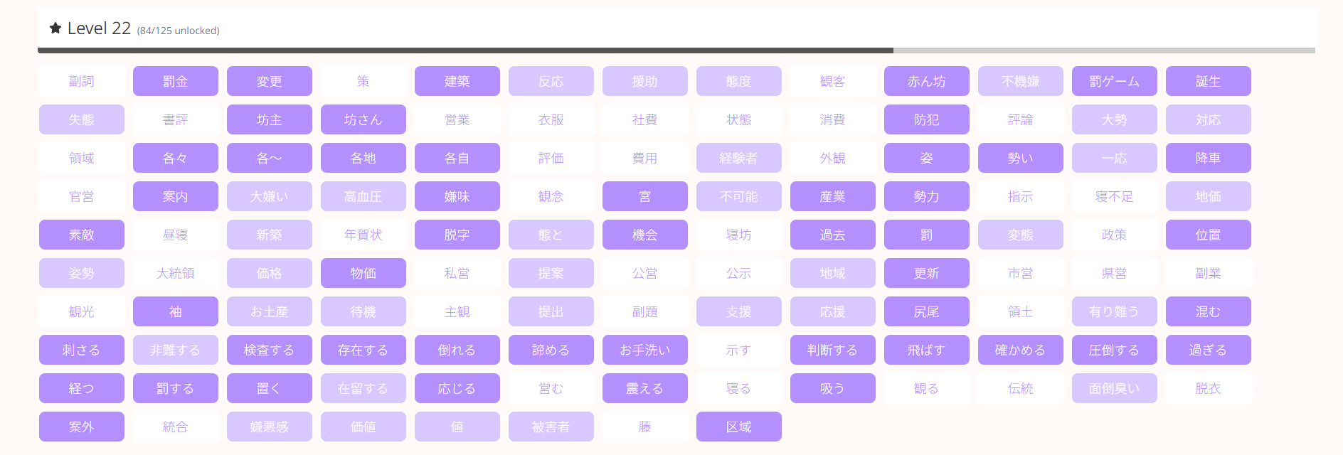
- the smaller kanji tiles are hard to read
- search results come up as tiles when it should be in a list format
- unlocked, critical condition and recently burned items come up as tiles compared to when it was in list format which was easier to read
- the layout, fonts, when doing Review or Extra Lesson are harder to read and distinguish when compared the previous layout - especially for mobile (phone and tablet)
Please fix this.
I am experiencing so much eye strain with these new UI changes as a result of the”New Dashboard”.
Please provide an option to go back to the old interface and layouts.
I know there’s people who don’t like it.
But, all the things you like are things other people have been equally passionate about not liking.
We are paying attention to it, but we are going to let it stew some more. Unfortunately, with design changes we can’t win either way. There’s always going to be some folks angry at us and I don’t want to make knee jerk reactions because things are particularly loud for a bit. We’ll look again when things have calmed down.
I get your frustration, I really do….y’all worked very hard on something, were I imagine proud of it…and here we are saying we hate it.
But….who are the people saying they really want the kanji to be smaller, and why? This is what some of us are having a hard time with. The game elements added to the desktop? Sure. I have zero interest, I know that others love it, fine, whatever. Not everything has to be for me, and I’m happy people are happy tracking their progress.
But the white space on the level etc pages? I….just can’t see that that has fans. Maybe the designers themselves? For whatever reason…but end users?? No, I don’t get it. Nor have I seen it reflected on these pages…Has there been one comment saying gosh I like all that white space? I’m good with the tiny kanji?? Or a request to make them smaller please?
None of that makes sense to me, and I don’t even see why anyone would want that. Please point out to me if I missed it. If I’m wrong, I will gladly admit it…I don’t have ego in this, I am fallible like anyone and will admit mistakes….I just want this site I mostly love to be fully useable (for me), as it once was.
That’s clearly obvious as voiced by numerous users.
Who are these people you speak of?
Designers who have implemented this user interface?
I’m guessing that you’re (or you have to) sticking with these smaller formats, layouts, etc to maintain the “New Dashboard”
This old version is easier on the eyes:

Compared to this eyestrain and poor use of white space:

Of the many dictionaries I have used through the years, they have the words in a list format.
Can you genuinely say that the search results is better in tile format compared to list format?
How long are you going to let it “stew some more”?
In my experience, this is management speak - "Let’s keep the change, they will accept it eventually whether they like it or not.”
With a huge change like this, things would be “particularly loud”.
"We’ll look again when things have calmed down.” Should I hold my breath for an outcome on this?
“Come on, mate. Fair go” (look it up on Google from the AI overview.)
+1ing this
I’ve been on the forums every day and especially engaged in all the chatter about recent site changes. The new dashboard- at large- has had a very positive reaction. Suggestions for improvement, sure, but all in a manner constructive towards better improving the otherwise universally appreciated new features and options.
UI changes elsewhere? I can’t recall a single expression of enthusiasm towards them- and if there was one or two I missed in this process, it is still a categorically-large and overwhelming ratio of negative reaction.
I’ve had my fair share of disagreements and criticisms with some recent changes/approaches to change here- but usually at the very least I can mostly get why. In this instance, though, the “we can’t win either way” sentiment is eluding me since the battle that statement is predicated on is one (saying from experience and not inflated hyperbole) nobody was asking to be fought to begin with.
Feel like I complain a lot here lately (unfortunately, I love WK) but for all this specifically it just seems like we are dealing with growing pains for an outcome still just unanimously tangibly worse than what we already had.
This baffles me as well.![]()
WK users have been “blindsided” with these changes and as you’ve pointed out, the negative reaction has been overwhelming.
I am hoping for some middle ground to be reached but from what I’ve read on @koichi ‘s recent responses in the other threads, it doesn’t instil any confidence moving forward.
I was at first disliking the changes and after sitting with it for a while, i can confidently say I will not be resubbing my yearly plan that is coming up for renewal soon.
Thank you for speaking up, This is exactly what @koichi and @TofuguKyle don’t want to hear.
I have a lifetime subscription, so I am stuck.
You have the chance to escape.
“If WK gave you the option to revert back to the old UI and layout for learning, would you maintain your yearly subscription?”
I would guess that there is a certain percentage of users that won’t renew their yearly subscriptions because of these changes. This would hurt WK’s revenue stream.
This sums it up best from chkremer:
How willl WK help (or plan to help) users with all the “feedback written up” given you now have “plenty to look at for improving the UI” ?
Is this just lip service?
Just chiming here to say that I have muted the thread of the feedbacks to the solution to “hover tool”, as I have found the Dashboard Progress Plus script, which puts back the hover feature almost exactly.
So now, either they put it back and I am happy, or they don’t and it wont change anything to me, my reviews and learning experience will not be impacted (as it was before the script got updated/made (I lost around 3/4 days))
It’s not like I will have new things to add about this subject anyway, I think we all made the point clear, and I dont see what more they need at least on the hover thing.
They can keep saying “but everyone loved the new dashboard” when it is not at all what people are criticizing here (I like the new dashboard / the update, as long as it doesnt impact my learning experience, which it did before I added the script)
But ofc, once months pass they will not get any negative feedbacks anymore because people will have moved on to scripts / third tier apps ![]()
I already noted on the release day that I liked the list layout of the pages much more than the new tiles, but after a few weeks of using it I can really say that the new version is bad so I definitely agree with everything OP layed out here.
Like some other people in this thread, I used the individual Kanji pages (and also lists) before to reinforce Kanji and Vocab and with the new UI it´s just not possible to do this as it´s hardly readable and distracting with the tiles. Also, the visual focus on the small boxes is just so much worse than the big colored boxes with focus on the strokes. I just hope it will be changed back at this point, I don´t think reverting the UI for the Radical/Kanji/Vocab Lists and individual item pages is going to affect the good design changes for the Dashboard at all.
I agree with this. I completely stopped using WaniKani as a dictionary. I also used to look at upcoming vocabulary to get a quick glance and see how many I already know, just to mentally prepare for the next level or just to browse for fun, which i completely stopped doing as well.
To me it feels nearly impossible to get an overview of anything anymore and I heavily rely on Jisho now.
The dashboard on the other hand I actually like (other than the points disliked by the majority).
I still love WaniKani, but my kanji study routine has def changed.
Same, I also like the dashboard but the update for other pages is.. not good.
Before, i like to use the self study script (that can hide the meaning) on those pages as a way to quickly test myself/ self study. But now I stop opening the pages entirely.
Could you quote those? Or create a survey about new layout (you can link to it on the top fo the page)?
Alas: why anyone in their right mind would like/prefer having smaller/tiny kanjis that are harder to read?! o_O
![]()
apparently i’m the only one, tho ![]()
here’s an old screenshot of my dashboard:

and here’s how the vocab page looked:

now my dashboard looks like this:
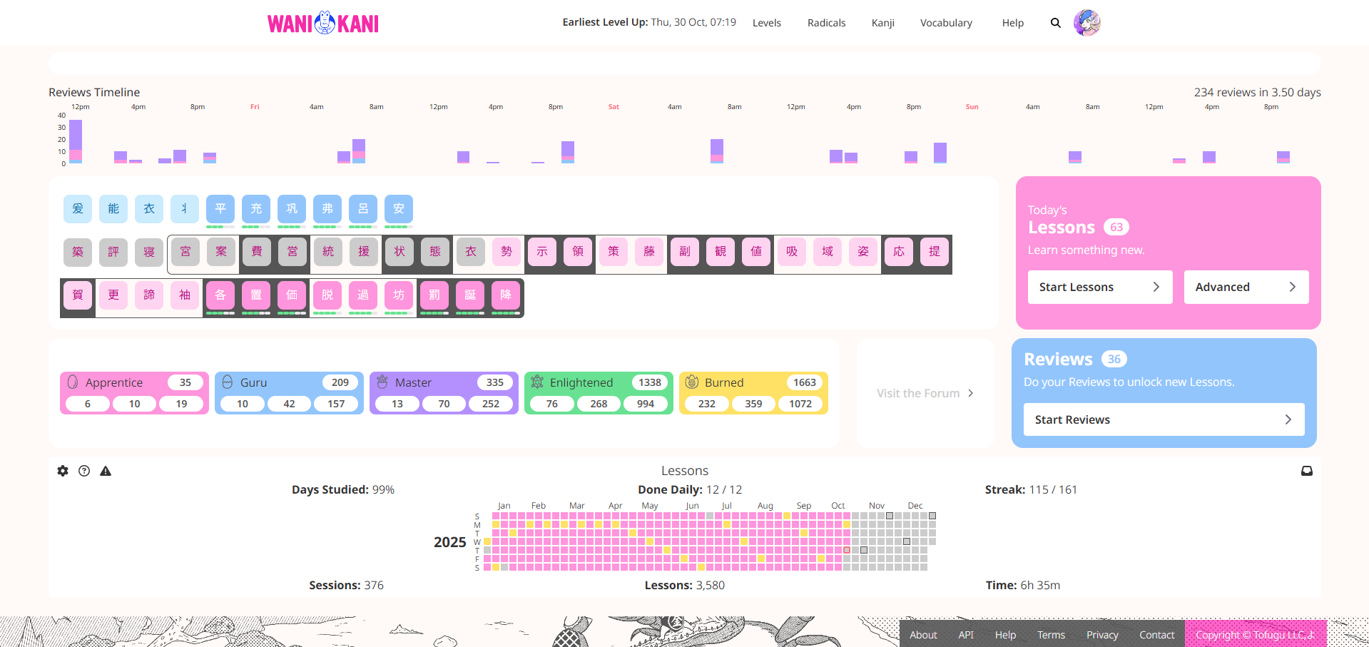
and my vocab like so:
i’ll probably change the colour so it’s all the same, but that’s it for now
i used a style to make the font smaller and in a grid instead of list
mind you, i did get rid of the white space, so i agree that’s a poor design choice
i didn’t like having more than one line of kanji ont he dashboard, plus it helps get me used to reading because generally font is not huge
edit:
i realise there are two lines now… i’ll have to change the padding on those
If that layout doesn’t hurt your eyes yet, you must be a young whipper snapper who isn’t the least bit color blind.