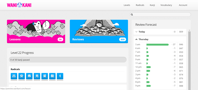
I think this is an improvement on “vanilla” WK for anyone who isn’t using scripts, but I’ll probably keep using Ultimate Timeline as long as it’s maintained. It’s more graph-like, and the extra info (splitting into radical/kanji/vocab by color, telling me when current-level items are going to come) is incredibly useful. The rounded end of the bars on the forecast are hell for readability, too. The new buttons are sort of cute I guess, but I don’t see how they improve readability beyond people who are starting out and using the page for literally the first time.
No, that’s what I originally thought, but the next day has both a total for the day and the cumulative.
I think the cumulative numbers are largely pointless anyway (at least when looking at future days) and make the whole thing extremely confusing, because there are just so many numbers everywhere!
It’s frustrating, because I don’t use most of the ‘fancy’ features of Ultimate Timeline and would be quite happy to switch to a simple inbuilt version - and I think providing a forecast is an excellent addition for new users. But this just isn’t quite enough.
Edit to add image of forecast without the cumulative numbers (just a daily total at the top)… mmm, simplicity
I think the cumulative numbers are largely pointless anyway (at least when looking at future days)
I actually really like the cumulative numbers, because I’ve got a sense of how many reviews I can do in a day and if I see that I’m going to go over that, I’ve got to make some time in the morning before work to do some reviews so that I don’t get buried.
But wouldn’t the simple daily total provide you that anyway?
Also, if you highlight the text it will give you the option to ‘quote’, and then people will know you’ve responded to something they said ![]()
@oldbonsai
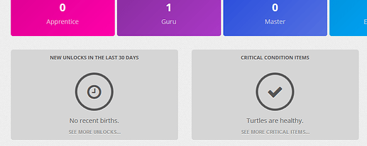
There is a bug. “See more” buttons appear even if there’s no any items in the list. Previously they didn’t.
Oh I see, when the day is closed you see the day‘s total - had not thought of that.
This doesn’t add any value for me. The lessons and review buttons were already very prominent right at the top. The number on them tells me everything I need know, a changing illustration doesn’t give me any more information. No idea why the buttons are so huge.
The time line shows my reviews if I do nothing, but I’m going to do something so the prediction is always wrong. When I look out five days and see this every increasing number, it makes me think I’ll be swamped with reviews so I should hold off on lessons.
Wanikani is great, why mess with it?
Of course I was expecting them to do all the major changes based on preview feedback before making a release announcement. That’s expected in dev lifecycle.
Seeing as this thread appears to mostly be people giving feedback for the first time, I wasn’t aware there was a previous topic. I think the first post in this thread says “once more” as a reference to the previous thread, but I guess I figured it was a reference to just… previous updates in general.
Related to that, they haven’t been pinning these announcement threads, which I think has reduced the number of people who see them substaintally (not only because they disappear from the front, but also because they look less “official” in the meantime).
I think I like it, but don’t know if I like the new timeline feature better than the Ultimate timeline plugin but it is definitelly better than what is currently vanilla.
I like it a lot. Thank you Wanikani team for your hard work!
As I’ve never used the ultimate timeline, the review forecast is very cool and informative! That’s exactly what I was lacking…
And I’m very slow at doing my lessons, so I guess the crabigator is going to be awfully annoyed by all those turtles!
The timeline is cool and works, but it need a 24 hour time format setting.
I don’t like the massive lesson/review buttons as the old ones were good enough and took way less space.
The search could be moved to the header as there’s plenty of room for it now.
While I like the review forecast being part of the official website, I think the presentation of the information is less than ideal. Before, the important information for me was presented prominently at the top of the page: When is the next review and (with the help of a user script displayed right next to next hour/next day) expected daily reviews, and the number of reviews and lessons was clearly visible in the lessons and reviews buttons. Now all that information was either removed completely (When is the next review? The forecast is no replacement for this information) or it is presented far less prominently (kind of hidden in two giant buttons or small and grey on grey background).
Oh, that’s lovely!
Oooh, heck! I’d better update the Leech Trainer or it’ll disappear.
I’m definitely liking the way your going with the update but it’s not quite there yet in terms of presentation for me. The new buttons take up an awful lot of space and push this level’s kanji out of view completely meaning I have to scroll down to get an overall view of my progress for this level. The proportions just need to be tweaked a little to nudge everything up and into view on the screen.
Oooh! I LOVE that!! ![]()
![]()
![]()
I really like it! Good job! ![]()
![]()
![]()
Though I really wish I could see the realistic number of next day reviews, where it’s assumed I will do all the ones for today. It get’s kinda hard to plan your next day work amount with the cumulative count.
OMG, a week of reviews. I am soooo happy!
The forecast chart looks great, and I especially appreciate being able to hover over the numbers for more context. The illustrations are cute too, though I think the buttons might be too big.


