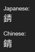
The default look for this kanji in Japanese is 錆. However, in Chinese, the default is 錆. This is how they are shown on 錆 - Wiktionary as well, but it doesn’t explain the difference. I know this type of difference between Japanese and Chinese fonts happens from time to time, but the weird thing is I just saw the “Chinese” version in a Japanese manga, so clearly it’s a valid font for Japanese as well. But 円 doesn’t really look like 月, so I don’t see how you get from one to the other. Anyone know what’s going on here?
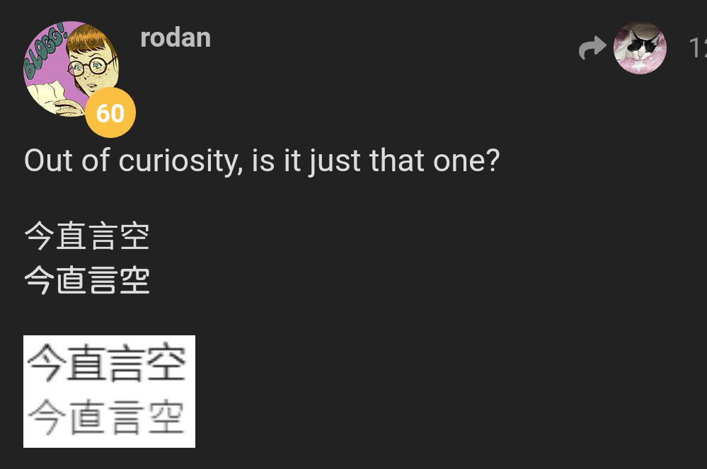
Images for people who don't see a difference above
There are a couple of pages about the topic in Japanese internet.
Long story short, 円 is the 旧字体 form of 月 in this case. Japanese, however, never adopted that for this series of kanji (鯖・錆), so in Japanese the correct form should be 円 alone.
That being said, early word processors had trouble handling such detailed characters, and the 円 might have been reduced to a 月 (or even something in between) deliberately to ease things up. It’s not 常用漢字 so it’s not like there are clear and strict guidelines, anyway.
Older computers (according to the internet, up to Windows XP? Dunno about non-windows OS) might still display 月.
The fact that 青 is omnipresent in Japanese AND is usually read as セイ, which is the correct on-reading for that kanji only makes things more confusing and even natives seem to mix it all the time, based on internet forums. On real life both are acceptable and no one would ever say a word, it seems.
But if you are going for a “correct answer” on a Japanese exam like 漢検 for example, 円 is correct and 月 is wrong. In Japanese.
The part about changing based on display has come up a few times in the past.
You can specify with markup which language to use:
錆
錆
錆
(from a computer at the moment without the browser set to use Japanese, so my browser defaults to Chinese/“zh”)
The unadorned one changes based on your browser language settings because the forum doesn’t specify a language.
For more about the topic, look into “unihan” - they’re stored as the same character because they mean the same thing and are so visually similar, so it only affects a handful of kanji.
(I don’t know about the original etymology question though and defer to the answer above on that)
I figured it was something like this, but since I didn’t see 円 mentioned on the 月 wiktionary page or vice versa I started doubting my gut. Funny thing is that I read it correctly as さび despite seeing it in a form I hadn’t seen before. What makes this even more interesting is that this manga (volume) is only from last year, so it seems like a deliberate choice to use the old form. I wonder why. It’s just a school comedy manga, so there doesn’t seem to be a good reason to use the old form.
It’s a very minor point, but I think that in a case like this either form of 錆 is “correct” even in a test like the 漢検.
You can confirm this by referencing this site: (「錆」の部首・画数・読み方・筆順・意味など) and noting that the 月 form is listed under 異体字 as 許容字体.
I wonder if the difference is the font? Maybe that one only has the one version implemented for that particular character?
I guess it doesn’t really matter in any way, but it’s mildly interesting at least.
Here is a document with a lot of similar kanji changes including 鯖 and 錆 if you’re interested: JIS X 0213:2004における例示字形の変更について and also an animation of the changes: JIS X 0213 - Wikipedia
I guess the suggested font display of these characters only changed in 2004.
A further technical interesting thing is that there are even more obscure ways of tricking the browser into displaying a particular character form. I recently discovered the font-variant-east-asian CSS property which allows you to hint to the browser that you want it to use the kanji form as exemplified in an arbitrary JIS-version.
I’ve always found some of the changes to be strange. Like why do when the left hand side is 食, which looks like the old one?
Similarly, why do when the right hand side is 弱, which looks like the old one?
I know that these kanji components often change shape when they are used on the side/top/bottom (e.g. 人 → 亻, 火 → 灬, etc.), but I still find it odd that they were changed so recently.


