Just ran through the thread again to see what I missed while searching for those books, and I figured I’d respond to a few things.
I covered what likely happens in classrooms just now, and I know for a fact that in China, teachers use the brushstroke style on the blackboard to teach students how to write. (I’m not from China; I’m from Singapore. I’ve seen videos though.) However, it’s not just limited to classrooms: all the people who provide handwritten models for writing base them on the brushstroke aesthetic, albeit usually a simplified one, which is the style that’s preferred in Japan. (The style common in China is often full of flourishes, but really messy and hard to read unless you know the cursive calligraphy and abbreviations used in China.) The people who are considered to have the best handwriting also write in imitation of the brushstroke style. Here are some examples:

from a book on how to write beautifully with a pen and

from a handwriting improvement book aimed at adults and

from Kayo-sensei, a Japanese calligrapher on Twitter who tweets in English (@kayoshodo).
Everyone is taught to write in the brushstroke style in everyday life. It’s just that not everyone masters it (I had to learn it myself from a calligraphy book after graduating), and factors like the need to rush during note-taking in high school or university leads to deformation and bad habits that make the brushstroke look disappear. I’d also argue that the reason brushstroke-style kana don’t appear in manga is because more and more manga is digitised, and calligraphy shows up poorly on tablets without pressure-sensitive styluses, and not because no mangaka uses the brushstroke-style. (Many of them have very neat handwriting anyhow.) Thus, in other words,
Exactly. The brushstroke style is the current ideal model and probably always will be.
The left-hand version is actually just a linked-up form of the right-hand version. It’s the result of making a very shallow丶that links cursively to short 丿on the right. It’s just that the cursive links can’t be reflected in a clean font like the one @plantron’s example used. That’s why the two seem completely unrelated. Watch the video in this thread starting at 0:47 to see how that happened starting from the source kanji (曽), which also has those two little strokes. Here’s an intermediate version, which is how I write そ:
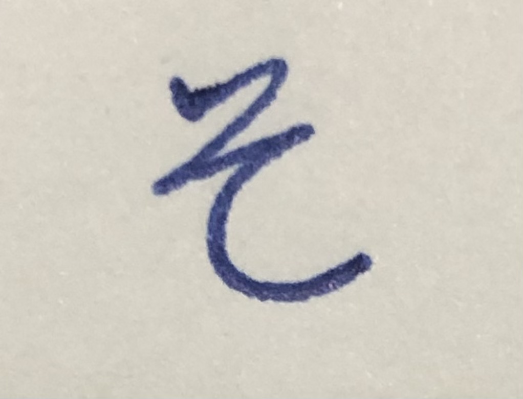
You can see that I start with a short diagonal stroke, stop, and cursively connect to the next stroke.