Books that show how handwritten characters look without the flourishes/print fonts?

Just ran through the thread again to see what I missed while searching for those books, and I figured I’d respond to a few things.

I covered what likely happens in classrooms just now, and I know for a fact that in China, teachers use the brushstroke style on the blackboard to teach students how to write. (I’m not from China; I’m from Singapore. I’ve seen videos though.) However, it’s not just limited to classrooms: all the people who provide handwritten models for writing base them on the brushstroke aesthetic, albeit usually a simplified one, which is the style that’s preferred in Japan. (The style common in China is often full of flourishes, but really messy and hard to read unless you know the cursive calligraphy and abbreviations used in China.) The people who are considered to have the best handwriting also write in imitation of the brushstroke style. Here are some examples:


from a book on how to write beautifully with a pen and

from a handwriting improvement book aimed at adults and

from Kayo-sensei, a Japanese calligrapher on Twitter who tweets in English (@kayoshodo).

Everyone is taught to write in the brushstroke style in everyday life. It’s just that not everyone masters it (I had to learn it myself from a calligraphy book after graduating), and factors like the need to rush during note-taking in high school or university leads to deformation and bad habits that make the brushstroke look disappear. I’d also argue that the reason brushstroke-style kana don’t appear in manga is because more and more manga is digitised, and calligraphy shows up poorly on tablets without pressure-sensitive styluses, and not because no mangaka uses the brushstroke-style. (Many of them have very neat handwriting anyhow.) Thus, in other words,

Exactly. The brushstroke style is the current ideal model and probably always will be.

The left-hand version is actually just a linked-up form of the right-hand version. It’s the result of making a very shallow丶that links cursively to short 丿on the right. It’s just that the cursive links can’t be reflected in a clean font like the one @plantron’s example used. That’s why the two seem completely unrelated. Watch the video in this thread starting at 0:47 to see how that happened starting from the source kanji (曽), which also has those two little strokes. Here’s an intermediate version, which is how I write そ:


You can see that I start with a short diagonal stroke, stop, and cursively connect to the next stroke.

4 Likes

The Kanji workbook for Tobira does have “handwritten” styles for the kanji it covers. It is not a workbook in the same way as the others I’ve linked though (it doesn’t give you space to write the character out for example).

That’s interesting. I wasn’t expecting that.

By the way, @virileboy, another place you can look at for examples (even if the kanji there aren’t necessarily all going to be useful for you) is in the Jōyō Kanji List. Take a look: https://www.bunka.go.jp/kokugo_nihongo/sisaku/joho/joho/kijun/naikaku/pdf/joyokanjihyo_20101130.pdf
Starting from page 7, you have a whole list of kanji meant to illustrate the presence of multiple equally valid styles and possibilities in handwriting, including kanji that don’t look like the standard Ming Dynasty Script used in Japanese typography, and they’re all written using a pen.

In my experience, this is true of Japan as well. I remember teachers using the chalk as if it was a brush (moving their arm in a flowing fashion and using the side of the chalk for emphasis, etc.). Kanji stroke order actually is easier to remember that way and the “flow” of the character helps with proportion as well. That may not be how every teacher teaches, but it’s how several of mine did (in US college classes as well, not just elementary school).

I’m not really sure that the type of book you are looking for actually exists at present, though it would be cool if it did!

1 Like

I use ‘flow’ to help me remember stroke order and visualise characters, and actually, the sometimes confusing ‘threads’ we see between strokes are just the result of stroke order being followed when going faster.

Are you talking about what I said here:

? Because I’m not sure exactly what you’re referring to. Sorry. :stuck_out_tongue:

1 Like

It was to the OP. I meant I don’t think there is a book with lots of actual handwriting samples and such. I’m not sure that’s actually what OP is after, or just my interpretation though.

Ah, OK, I had that impression, but since it was also a reply to my post…

I think the link you posted to that N4 book is the closest one can get in English, though I honestly feel that the handwriting samples provided are too much like Jisho animations. They’re neat, tidy and well proportioned, but don’t feel like what a native would be taught as a model. They’re a bit ‘lifeless’ if you ask me.

In Japanese though, books containing actual handwriting samples or styles that can be imitated easily with a pen exist. I’ve already posted several examples from courses for adults that can be easily found on Amazon by searching ペン文字, and in particular, this course (found by searching 小学 漢字 練習帳=‘primary school kanji exercise book’)

contains 手本 (models for imitation) that were written by hand by the author himself. The Twitter calligrapher I mentioned (@kayoshodo) also publishes her own books, which may very well contain such samples.

My understanding is that it’s traditionally quite common to use samples of a master calligrapher’s work as a model for calligraphy practice, and with modern printing techniques, it’s become even easier to buy copies of such models. Such books exist in Chinese as well, and in fact, the calligraphy course I used to learn to write well, which I ordered from China, was filled with the fountain pen calligraphy of 田英章, a well-known Chinese calligrapher.

In short, such books do exist, and are in fact very common, but you’ll have to buy them in Japanese or in Chinese. The diagrams of kanji inside should already be quite instructive, because there are usually lines to highlight proportions, general shapes or important features, but to fully benefit, one has to be able to read the instructions and explanations. That’s the sort of book I was talking about when I said

because real calligraphy books use the author’s work or analyse famous historical works and comment on them. Computerised fonts, no matter how beautiful, aren’t sufficient for calligraphy teaching.

3 Likes

I was only thinking of English, but you’re right. That looks perfect (sorry, I didn’t look at it closely before).

1 Like

It’s OK. My post was long and potentially tiring to read. :stuck_out_tongue: Details tend to get lost in such posts.

1 Like

I found this book while I was studying in London and wanted to practise writing Japanese. I don’t know if this is what you’re looking for.

1 Like

It doesn’t load for me either but the Skritter app has a wanikani deck to practice writing but it does have errors sometimes like some characters are taught in print font form not handwritten.

Already had the 2nd book in my Amazon Japan cart :grin:. Took me hours & hours of translating each book description few weeks ago to end up with discovering the calligraphy guy. This is the kind of stuff I’m looking for, cause explanations are never there in the English books.

Do you mind showing a dragram of the ink threads in a stroke that are not critical? Not sure I get it.

1 Like

i have no issue with brushstroke but the lack of instruction on how to physically move the writing utensil to create the character is irritating. English books don’t even talk about stroke ends which is why so far I have only bought Japanese writing books.

1 Like

Perhaps I’m a little oblivious as a native kanji user (as a Chinese speaker), but this is precisely what the ‘standard script’ (楷書) brushstroke scripts are for. They only show the essential parts of strokes, and all that’s required is imitation using standard strokes while following stroke order. However, perhaps the fact that I’ve seen both the brushstroke characters and attempts to write them by hand side by side is what allows me to know what is ‘essential’ and what isn’t.

I’ll try to provide you with two examples, but I doubt they’re very good.


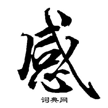
In this example, the little flick at the bottom end of the central dot (the 丶 to the left of a blue circle and a dotted arrow that curves back on itself) in the 心 component is non-essential. You can tell based on the fact that it doesn’t exist in the brushstroke-style stroke diagrams. Comparing multiple 楷書 (standard script) examples should allow you to figure out what remains unchanged. Honestly, even comparing multiple common computerised fonts should show you what remains unchanged. That’s the skeleton of each kanji that needs to be reproduced at the minimum. Like I said, if you remove all line thickness variation, you’ll see what the minimum is.

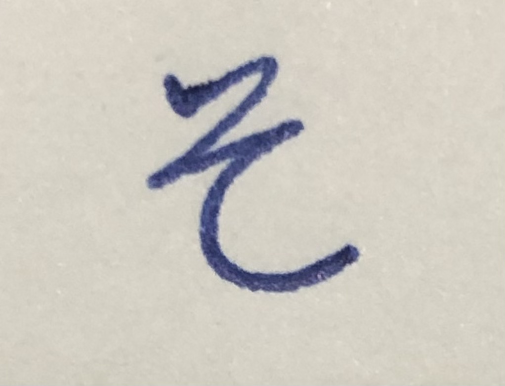
A second example using the same kanji, but in a semi-cursive ‘running script’ (行書) style:

You’ll notice that the size and position of 心 have shifted slightly. This is just a stylistic difference. There’s no easy way for me to explain this rule to you without lots of visual examples, but basically, in 行書, when there’s a long 乚 shaped more like 乀 and a small component at the bottom of the character (盛 is another example), it’s common to extend it as the ‘main stroke’ of the kanji and to shrink the ‘base’ element (e.g. 心、皿) while shifting it to the left. Notice all the extra details that have appeared relative to the stroke order diagram and the kanji written with a pen (which is in the 楷書 style): all those little links are there as a result of speed, but none of them is necessary to the recognition of the kanji. Notice also how the ‘lines’ as a whole stay the same. (This is in large part simply because we’re not looking at an example that uses cursive shorthand.)

If you want more examples you might want to use this Chinese site:

Be sure to select ‘不限’ (‘not limited’=‘no filtering by style’ in this case, which is similar to 無限 in Japanese, which is ‘unlimited’ and therefore ‘infinite’; the difference is that 不 is a negation particle in Chinese=‘not’, whereas 無 means ‘non-existence’) before typing anything into the search bar so you’ll see multiple styles. You can ignore 草書(草书 in Simplified Chinese)if you want, since most kanji written that way aren’t what you need to learn and are very different from the standard script. (Of course, some Japanese kanji won’t turn up on that Chinese site, so please just use it as a tool for style comparison. I’m recommending a Chinese site because for some reason, the Japanese internet doesn’t seem to have gigantic free calligraphy databases of that sort, unlike the Chinese internet.)

Another thing that might help you is seeing what most of the basic strokes look like when they’re isolated. Complex kanji are really just a combination of all these strokes at slightly different angles and with different ‘joins’. This diagram is very helpful because it shows you what the brush head looks like during the writing process:


More examples, especially of ‘hooked’ strokes, which often need to be kept ‘hooked’ in order to be correct (though this is not so often the case with Japanese kanji, which allow more variation than Chinese hanzi in their ‘standard’ handwritten form):
cee945a1f2ec9e83321a9a5ac61d6736
Ultimately, what I think would be more helpful is your sharing what you find hard to distinguish as ‘essential’ or ‘non-essential’. That might help me explain better.

I went for calligraphy classes in primary school (when I was around 7), so I guess I was fortunate enough not to need to find such instruction on my own. The first ‘isolated stroke’ diagram above shows you roughly how the brush (and thus the tip of the pen) should be moved to create the right contours. Here’s another example with 永, which is often used for calligraphy instruction because it’s a kanji that contains all the basic strokes:


(The names for each type of stroke are in Chinese. Japanese uses other terms, as far as I know, so don’t worry about learning them.)

The only major problem with this diagram: the instructions for making 乀 are wrong. You get that thickness by pressing hard with your brush/pen, and you don’t loop: you change the angle of the stroke as you finish while releasing pressure/lifting the brush. Everything else is fairly accurate.

My final recommendation would be to watch calligraphers at work with either a brush or a pen. This person (Takumi) has already been recommended to you because his pen writing is generally quite clean and simple:

You’ll probably (and perhaps ironically?) learn more by watching videos in which he writes kanji with more flourishes, however, because that’s where his use of various techniques becomes obvious. Pay close attention to how the pen nib moves and when he makes more exaggerated movements or moves the pen faster. Also pay attention to when and how the pen stops. Stopping is also essential to creating certain effects, especially when stroke direction changes more than 45º or so. It’s probably easier to see variations in pressure and speed with a brush though (the brush head will flex), which is why I recommend looking at such examples as well. This example of hiragana writing should be instructive:

Here’s another example, this time from a well-known Chinese calligrapher speaking in Mandarin. He’s writing in the 行書 style. You may not recognise all the kanji, and that’s OK (it’s a very long video anyway, so feel free to skip around) – pay attention instead to how he moves the pen and how that creates certain effects and contours. 行書 is particularly good for studying how flicking the pen or stopping it abruptly changes the ends of strokes and allows faster writing by ‘disengaging’ from one part of a character or by ‘transitioning’ smoothly to the next:

(And so uh… yes, my calligraphy style is based on a course he wrote. I doubt there are any obvious similarities though.)
The techniques used are always the same. How they’re applied just varies depending on the style of writing.

2 Likes

This topic was automatically closed 365 days after the last reply. New replies are no longer allowed.