Instead of

why not
I always have to hover over multiple times because it’s so small and I want something bigger so that it’ll burn it in my head better (for visually similar characters)
Instead of
why not
I always have to hover over multiple times because it’s so small and I want something bigger so that it’ll burn it in my head better (for visually similar characters)
I must say, I do not see any drawbacks with this.
Looks great
Looks… Spicy
I’m all for this. Such a small modification but big impact.
I’ll chime in for larger kanji! Also, Spicy! Or Dry even!
(Check Asahi beer label for clarification)
Definitely looks better ^^
I got your back
[edit: not the same as your suggestion, made it awhile ago - but bumps kanji/vocab in general around the site]
Yes! This would be so helpful, especially with more complex kanji or when trying to study visually similar kanji.
@komocode, have you considered tagging Viet? Apart from userscripts, none of us can do much about this. Though I am totally onboard ![]() .
.
A tiny nitpick for me…
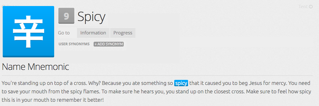
The “9” now feels in the way. I’d keep the level number where it was. Maybe even make it smaller… I just don’t like it there between the kanji/radical/vocab and the English meaning. (And readings that would be there on kanji and Vocab pages)… That way, all the relevant information can be seen in one glance - better for visual learners.
how do i tag him?
@viet , that’s how.
Hello Viet.
Simple idea, yet big impact and no drawbacks. I support this!
MAGICAL!!!
This topic was automatically closed 365 days after the last reply. New replies are no longer allowed.
