I’ve got Starting Point, a book of essays by Miyazaki, maybe there’s something in there. (Or the sequel, Turning Point, which I don’t have.)
I dunno, that guy doesn’t look like the most observant character I’ve ever seen. ![]()
I’ve got Starting Point, a book of essays by Miyazaki, maybe there’s something in there. (Or the sequel, Turning Point, which I don’t have.)
I dunno, that guy doesn’t look like the most observant character I’ve ever seen. ![]()
Read through a bit more today, still not done with the first week but making some good headway.
I think a lot of the discussion and questioning about the reasoning behind the ジル comment on pg 28 can kinda be summed up by the discussion in the bottom panels on page 30: less about her not being capable, more about population decline being a serious threat to a kingdom of 500 people, yupa also starts talking about this higher up on page 28, but gets stopped because it’s too much of a bummer
Also really liked this comment ジル made at the end of that exchange: 「おろかな戦とはわかっている。しかしツバメもタカとして生きねばとぶこともかなわぬ世なのだ」
oh lord I didn’t realize jojo was that old ![]() but I will also go out on a limb and say that, for as many strengths miyazaki has as a writer and artist, it’s hard to top araki when it comes to stylistic flare
but I will also go out on a limb and say that, for as many strengths miyazaki has as a writer and artist, it’s hard to top araki when it comes to stylistic flare
It’s going to kill me if I can’t remember what series I’m thinking of, I’ll sleep on it and see if I can find it tomorrow. The memory I have of when I saw layout and especially the line-work comparisons between them was almost revelatory, maybe i’m remembering it as more significant than it was, though.
I really like this analysis, and agree that the tone of the story is mostly going for a big, sweeping, epic narrative vs particular high-octane action stuff. The only times I really notice the focus on the action are for planes/glider stuff, and, well, that’s probably just a “miyazaki really likes planes” thing haha
I can go borrow my friend’s copy of Akira next time I see them and get some comparisons to that, if someone doesn’t have it on hand, but I do remember it being fairly similar in layout style.
As for the thought bubble being a thought rather than a whisper, even in Nausicaa it appears to be both: at the top of pg 33 as she is hearing the voices, I definitely read those ones as her thinking to herself, not whispering those aloud. I know in the movie adaptation as she’s interacting with テト for the first time that’s rendered as soft speech to calm him down, but in the manga I’m not sure if it is actually implied that she’s speaking here or whether it’s related to her animal/bug telepathy stuff
Oh maybe! That’d definitely be a good place to check
not sure why that replied the way it did, oops, I added and deleted some quotes about the pg 28 stuff i think ![]()
That’s interesting about Metropolis!
I guess we’ll see with Nausicaa. I was thinking that it’d be nice to see the toxic jungle break the panels because it is so encompassing and engulfs anything of a human scale. I wasn’t thinking so much about it in a apocalyptic way but rather, nature doesn’t stay within boundaries kind of way.
As for Akira, I happen to have vol 1 at home, so I’ll try to skim through it tonight and share any panels that stand out.
Lol, I’m constantly reminded by my 60 and under male coworkers who read it when they were younger. I’ve only met one female coworker who admits to having read it.
Would you believe that a lot of contemporary criticism accused him of copying too much from Fist of the North Star for Parts 1 and 2?
頑張ってください
Edits to include more replies and a summary tag- done!
I’m not going to type a bunch just for discourse to delete my post without warning, so photos first.
Having just skimmed through Akira, the biggest thing that jumps out to me is page composition. Whereas Miyazaki composes every panel, there’s not much composition to the overall pages.
I should have probably taken this one normally, but you can pretty easily see how those lines on the left page are parallel to the top of the photo. Then, when you take the other page in, you can see they make these sort of arrows or triangles.
We get more arrows here on the right page. The sides of the stairs are pointing us down and as we go down them, those lines are almost paralleled as we move down the page itself, by the lines of the panels. While the bottom most panel isn’t an arrow anymore, the guy’s body aligns with the right hand lines.
This setup is just great. The foreshadowing is chef’s kiss.
Compare that with Nausicaa though,
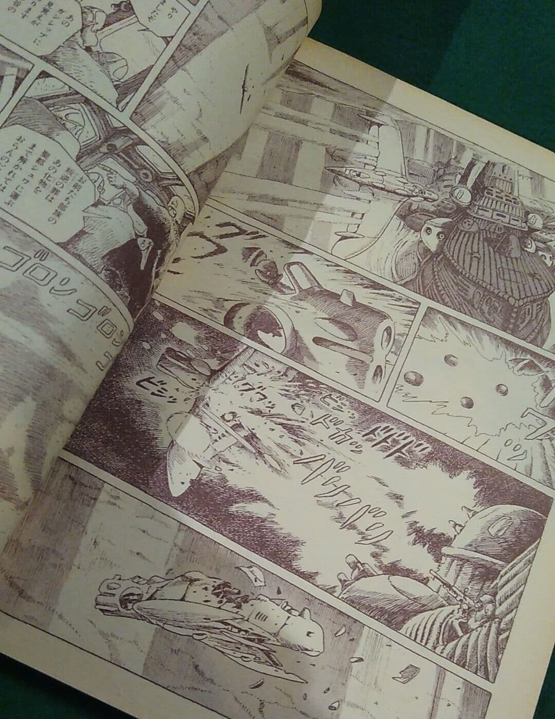
Miyazaki could have had Nausicaa and the knight (forgot her name sorry) facing each other on the pages. And honestly, flipping the Nausicaa with her sword extended straight to the left so that it looks like she’s crossing blades with the image of the knight on the top right would have looked so cool and also more clearly established that they’re fighting each other. However, the way that they’re directing blows to the outside of the page just isn’t doing much. The pages look messy. Maybe that’s the intention, but I can’t help but feel like the execution is something like attempted Rococo, but resulting in Maximalist.
Also, it’s hard to tell what direction things are…
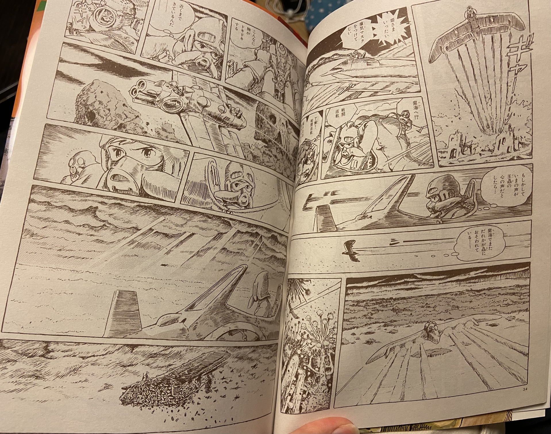
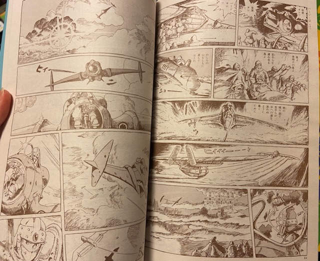
Both of these spreads just scream that they’re going in circles/all directions to me. That’s ok for the dogfight, but when they’re approaching the ship with insects, it feels like we’re going everywhere, rather than a specific direction. Going back to what I said at the beginning of the thread, it feels like a storyboard without panning/zoom directions. It looks great in a movie, but not so good in a comic.
Every panel is lovely, but they feel and look like isolated blocks from each other.
Compare that with…
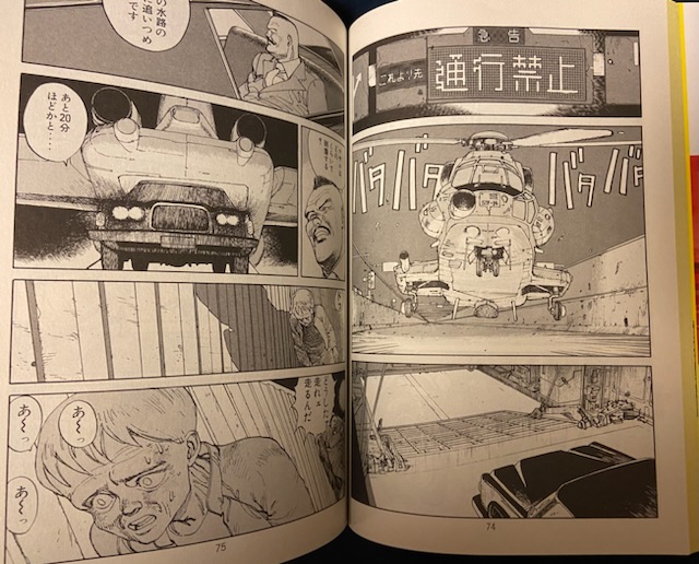
We’re landing, then opening the door, coming out the door and then we see this guy walking- first he’s far away, then he’s closer and we can infer so much more about his state. In addition to that, the scene builds this ominous energy. 進行禁止, an area we’re not supposed to be in, a mysterious car from a helicopter, a guy who looks like he’s seen/experienced too much. There is so much more story here than just a plane flying around that spots something.
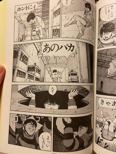
Lastly this page. We see he’s down below a manhole cover and the next panels, instead of just showing him getting out, show him still below the manhole cover, partially because the under the surface is literally showing below the surface. It provides a continuity through the page, almost like the camera is slowly moving down.
Oh also I see thought bubble thoughts lol
tldr: Miyazaki makes a manga out of storyboards rather than a visually cohesive manga.
edit because I need to get this out of my system. It’s not the blockiness of the blocks, but how you use them together it seems. Akira and Nausicaa are both very similarly blocky.
The one she’s fighting? That’s not “her”. Actually, I don’t think he ever gets a name.
I’m not sure exactly what you mean here, but they’re not going in a specific direction, they’re searching for the brig. She doesn’t know exactly where it is, just “over the Sea of Corruption somewhere”.
Fun fact, some panels were redrawn to improve page layout when the collected volumes were first released. You can find comparison images here (note that it has examples from all through the manga, so most definitely contains spoilers).
Yeah, I haven’t actually read the text on that page, so I tried to remember the movie events.
My bad, I was trying to be fair to both works by avoiding reading any of the words when skimming for layouts. I only read 進行禁止 and 鉄雄 in Akira. Page 16 is probably more clear. In the panels Nausicaa moves down, up/out, left and then right to get on her glider. Getting various views of the glider/getting on the glider make way more sense as a movie shot than as manga panels.
Page 17 is a bit better about this since we gradually get closer to Lord Yuba, but Nausicaa’s size varies a bit because ???
That is fascinating! I need to find a website like this for JoJo. The only changes I can recall seeing is a cover design change for ??? reason and a redraw of a scene that involves a mosque being damaged in a brawl across Cairo, the city of a thousand spires, because all religious buildings need to magically be spared, sorry random background bystanders. It’s interesting to see the edits that Miyazaki makes since he is the one in control I’m assuming. So many of his works are intended to push his political views to some degree. I’m tempted to look at more of these panels, but I still need to do regular reading today, so hopefully another time.
This does let me get better what you mean, thanks!
I don’t think I quite agree, or at least not whole-heartedly. I haven’t read up to most of those spreads yet, but the one super early on with the plan (p. 16/17 it sounds like in your edition) as an example I do see the ‘camera’ moving around and switching sides a whole lot, but I didn’t find it at all disorienting when reading, I think for a couple reasons: first the important directions at that point are very very well-established: ‘to glider’, ‘to flare’, and then ‘the direction the huge bug is chasing the guy’ and secondly I admit holding that huge book makes it extra easy to pause at each panel and let it breathe fully as its own thing.
You might totally be right that it’s animation/film sensibilities at play in some way coloring how that kind of action scene is set up, rather than fully comics-oriented ones. But I’m reluctant to personally chalk it up as a bad thing, vs. a measured, “Miyazaki in Nausicaa is doing X while Otomo in Akira is doing Y” type of description (but that’s easy to say of course having not been disoriented myself).
Moreover though – one fascinating thing these pictures reveal is that I’m reading a very very different edition than you…
The pagination in this version means the spreads are all offset! Your left pages are all my right pages.
For example, here’s what the later on plane one looks like for me:
This honestly seems like such a big difference layout-wise that the fact that two editions exist this way in the first place either totally makes your point, or implies a bunch of people screwed up somewhere in the publishing process of one of them, or both.
I hate to say it because I don’t want to talk up the expensive and impractically huge edition too much… but it seems like the versions of the spreads I have are markedly better across the board.
In the plane one, the visual continuity of the shocking image of the plane is maintained across pages,
and in the fight one you posted, my version has the killing stab as a turn page reveal, which I think totally fits with that action.
And of course when you say “directing blows to the outside of the page” … well, in my edition they aren’t.
Gosh, even looking back at the very early part with the plane,
a lot of why I don’t agree with your concerns there are contingent on: the four small shots of her getting into the plane with shots from perspectives all around her are right at the end of a page before a page turn so maintaining a visual line with the coming action doesn’t particularly matter and the frantic layout emphasizes her urgency,
and then two big open layouts after the page turn.
Edit to add: another clincher for me that this ordering is better spread-wise, is at the first “chapter break” when she’s heading home, my edition has the one panel of her flying to the city at a page turn, then after the page turn both pages are in the night scene with everyone together home. Just seems like a natural transition compared to if I picture the reverse (assuming there isn’t a blank page or somesuch inserted in there).
… Honestly it’s starting to look to me like you’ve been unknowingly grating against a misaligned page layout. Which is impressive!
It sucks that by mentioning this we’re all definitely going to be self-conscious about this going forward.
I would be curious if someone found more info about it - you gotta imagine one way or another there’s complaining reviews out there.
Huh, interesting. My seven-volume Japanese edition and two-volume English edition are the same as @DIO-Berry’s, but my four-volume English edition is the same as yours (and also flipped so it reads left-to-right, because that was commonplace back in those days when translating manga).
I wonder which way it was in the Animage issues? (It might have varied from issue to issue I guess.)
May contain spoilers, but here are some Animage photos from eBay listings to compare by:
I also found one from the first page of the series’ debut, which notably does not line up with my edition (since mine has this page on the right)
(pretty slick how they replaced the title with that cool borderless shot too)
I was hoping archive.org would happen to have some scans from around this time, but alas I didn’t find any…
Woah that’s wild! Mine are also backwards from that like @DIO-Berry’s are. I have the animage ワイド判 version, it has 2001 print date on the back cover. Looking at the revision comparison, mine also definitely is the revised art (nausicaa’s back has shading on pg 11).
Knowing that there are multiple versions and that some have some pretty substantial edits is actually good to know now though, might help with some confusion about questions in the future haha, if someone somehow accidentally ended up with an unrevised edition.
Now seeing that it’s probably not closer to the original format, I feel significantly less confident about the layouts in the version I have being the better of the two alternatives. It’s definitely interesting! Publishing comics seems… like there’s a lot to keep track of.
I suppose that they can both exist like this at all suggests that what Miyazaki was turning out at the time was pages, without the option of knowing where full spreads would occur (or at least happening to not put in any critical spreads)? I wonder if in that context he would still be conscious of what the magazine layout would be or not. I suppose probably (that first page of the series does work real good as a standalone hook), but who knows.
Damn, the reformatting did Nausicaa dirty!! The changes of the layout from the original mangaka’s intention is pretty important from artistic standpoint. Whatever free time I had in high school that wasn’t spent on reading in English, I learned about art theories and techniques. I didn’t focus on comics too much, but the use of the page as a whole is considered quite important.
Thank you for letting me know about the offsetting! I think I’ll just write this version off as an inferior one, just the swapping left/right pages bugs the shit out of me.
Wasn’t Miyazaki already famous by that time? I can’t imagine the publishers not letting him choose which side the pages will be on, especially given that ads are moved around just for this reason I feel.
Hmmm, I dunno! Maybe among Animage readers? Seems like we’re pre-Ghibli and he’s directed only one movie (but I mean, it’s Castle of Cagliostro, a classic). So if he’s famous in 1982 it would be for that and/or television work like Future Boy Conan. Which I mean, certainly is far from nothing, but I think it’s this work and its movie adaptation that really catapults him into like, starting an acclaimed studio and everything.
I think with the edition I have being in the minority (it seems like even an English-language two-cover hardback that looks based on this one is the layout you have), it seems difficult to tell what the artist’s intention would originally have been, and the original layout in the magazine probably being the layout you have makes that one more likely as the authoritative one, I think anyway.
Something I have been a little grumpy about in the past is big treasury editions seeming to especially want to scrub any trace of the original chapter format in magazines (I’m thinking of Rose of Versailles). I could potentially see this page business as an outgrowth of that maybe. Sorry my bringing it up ended up muddying the waters!
According to Marc Hairston’s lecture on the subject (which no longer seems to exist on the live internet, but can be found on the Wayback Machine here), Animage approached Miyazaki to do a manga, rather than the other way around, so I imagine that gave him some bargaining power - most notably, he agreed only on the condition that he wouldn’t be required to turn it into an anime (even if they did later renege on that promise).
Yes, but also several anime series, including Anne of Green Gables, which to this day still remains more well-known to the Japanese people than the original novel. Also Heidi, Dog of Flanders, and Future Boy Conan, among others. It’s his fame in directing TV anime that lead to him being asked to direct a Lupin movie.
This is definitely splitting hairs since I 100% agree he was a respected and known animation figure at the time, but I got the impression he got the director job for Castle of Cagliostro because he had specifically worked quite a bit on the Lupin III tv show and directed episodes of that (rather than because he was generally famous) and it was his directorial debut in terms of movies/full series. Looking over his filmography, at that point he hadn’t done Future Boy Conan yet, and everything up to that and Cagliostro seem like roles that - while being 100% meaningful - don’t seem to me like they would be fame-generating except maybe among outright enthusiasts or within the industry (like it just sounds like he worked in some capacity on Anne of Green Gables, rather than being a top person involved).
Cagliostro and Future Boy Conan are totally enough to be famous in the context of an animation magazine though! And I could 100% be underestimating how well known key animators in anime are.
The Nausicaa wiki says Miyazaki himself made changes for the Animage 7 volume set that included getting rid of chapter number panels and story-so-far recaps (and occasionally fixing panels or rearranging them). So in that sense the 7 volume set is perhaps closer to what he wanted than the magazine version?