This post is about how to use the Heatmap script. It displayed a colored calendar such as this one.
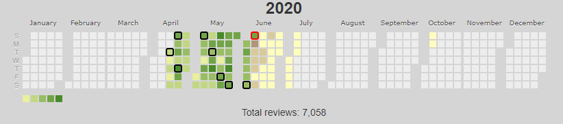
If you move the mouse pointer over a day it displays the number of reviews for the day. You can set it to display the number of lessons but I am interested in the reviews. At first I thought of this script as a source of data to support my motivation. Then someday I clicked on one day on a whim. Surprise! Detailed data popped up. There is more to this script than what meet the eye.
The data differs depending on whether you click on the yellow area or the green area. The yellow area is the future. It contains data about the reviews that are currently scheduled for the day. In particular there is a break down of the reviews by SRS stage. Did you ever wondered how big of a workload the Guru/Master/Enlightened reviews are? Heatmap tells you this. You will know if this workload is a sizeable chunk of your total workload. You will know if it is spread evenly in time or if there are big spikes on some days.
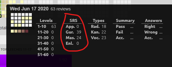
The green area is the past. It contains data about the reviews that were actually performed this day. In particular there are accuracy statistics. This is great to bask in contentment when you did good on a particular day. You may also be depressed if you did bad. It also keeps tack of the effect of changes to your Wanikani routine. For example I decided to add some extra studying to my routine because I was unsatisfied with my accuracy. I knew subjectively that it worked great but with Heatmap I can back this up with data.
Here is a typical day before I introduced the extra studying:

Here is a typical day after the extra studying.
