so this topic has come up ever-so occasionally, but when it does, there are a lot (a fair bit?) of people who come forward and speak to their experiences with differentiating the reading and meaning sections of reviews.
my guess is that it comes down to the whole page layout, the reading and meaning bars don’t take up much room. they’re only a small slice of horizontal space on the screen. they’re not really interacted with in any meaningful way so our brains have learned to ignore it, similarrrr (noncommittal hand gesture) to the banner blindness effect.
i don’t know if there are any language-learning ui/ux designers out there, but if there are, they’ll have more of an understanding on this, i think.
personally, i don’t really have this problem, except sometimes i’ll space out and type in the english meaning in the reading field, however, a step towards higher web accessibility would be nice, just on principle. i’m sure low-vision folks and anyone else who need the contrast would appreciate it.
i felt bad for laughing when i read that someone was going to take screenshots in an hour of their posting to prove everyone wrong and just never came back in the 11 hours after when i had seen it
so i’m doing some reviews now and i’m using the wanikani breeze dark theme for the stylish add-on, and i’m noticing that consistently that i’m able to focus on the middle “meaning” and “reading” bar and the kanji/vocab at the same time. there’s less contrast between the two areas that display the kanji and answer prompts. however what does change color is the kanji or vocab itself, which makes things very readable.
when i do reviews on mobile or tablet, the brightness of the pink, blue, and purple backgrounds overshadow the non-bright black and white banners of “meaning” and “reading”. the differences in brightness/saturation may also contribute to the ignoring of the actual prompts.
Or perhaps black-on-white for meaning, but white-on-purple (or white-on-pink) for reading. I think Tofugu would need to do actual usability studies to see what worked best. Maybe by giving some new users a couple free levels in exchange for participating.
Hi! I’m also new here and I had your same issue. I solved it by installing this reordering script Wanikani Reorder Ultimate 2 that allows you to reorder the reviews so that you’ll always be asked the reading first, and right after that the meaning (or vice versa). It takes no time to get used to answering first in Japanese, then in English!
I fully understand the “pics or it didn’t happen” posts. I always come here after finishing my reviews and lessons, so I of course have nothing to show right now. however, when i get a chance to later today, I’ll post the pictures for everyone. (If you hadn’t figured it out, I still don’t know why they don’t invert… Is it possible that the API causes the invert after you turn on any script, including the “overwrite” script? Because I don’t have any turned on at all.)
I don’t have any scripts installed on any machines right now, and I’m almost sure it has the correct backgrounds - let me do some reviews to check real quick.
Confirmed working on Chrome:
If that’s not what you see, then something is not working correctly
Thank you @Leebo and @Darcinon for being willing to test a possible cause as I continue to try and find the reason.
I am sad to hear my guess was incorrect (although i had figured as much, otherwise there would likely be more shocked people over the color change.) So I will continue to try and find the reason. Because I do not see the black-background white-text Reading views. Both of mine are the grey-white background black-text version…
Next curiosity, though I doubt this is it either. Are you both using the Dark Theme? I am using the standard bright theme.
EDIT: Additional thought I just had. Do either of you have Rikaichamp installed? I do, (though have it turned off most of the time.) I wonder if it could be interacting with the page coding at all…)
I’m using the bright theme - I haven’t touched my theme settings. I remember they added the different backgrounds sometime in… 2014 maybe? I don’t think the dark theme existed yet, lol
@Darcinon, Thank you for confirming it’s not theme based either… It had just been a thought, as it was something that I knew of in WK with color changes involved.
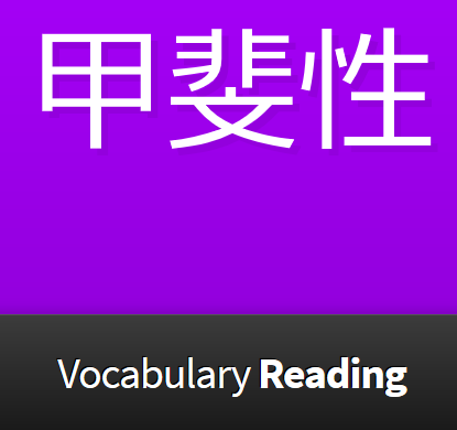
that would be impossible. there aren’t any themes on wanikani unless you install a browser add-on. wk breeze dark looks like this AND the middle bar doesn’t change color (where it says Vocabulary Reading):
thank you @lavendara I had expected as much. I was just trying to think what causes might be common enough between us users not seeing the color change, that might be different from those that do.
So, when going through trying to find an issue, noticed my firefox was way out of date.I updated it, and now I see the color change. However, as I wasn’t looking for it until recently, it is possible it was doing before and I didn’t notice it, because the space under the text line remains grey, and it merges the color for me somewhat. (just a note that in a way to make the change more obvious in the future.) Either way, I am resolved, and thank you to those who put in effort to help me.
Doesn’t Firefox update itself in the background? I never have to manually update my Firefox on Windows. On Linux I run the package manager in a cronjob and it also runs in the background. I haven’t used my Mac in about 2 years but it’s the same there.
I actually am using work machines, (I am part of the IT team, and practice on WK during my down-time) which through various Group Policies, prevents auto-updates of software, including Firefox… As several of what we are using at my workplace is so old that updating things breaks it. Before running the update on my firefox, I made sure that Mozilla still carries an installer for the version in its legacy versions… In short, this was a situation that, for me at least, could’ve been caused by all sorts of situation-specific issues. It also means, I do not know if anyone else who had the problem, would at all be under the same problem. However I wanted to post what solve my issue here.