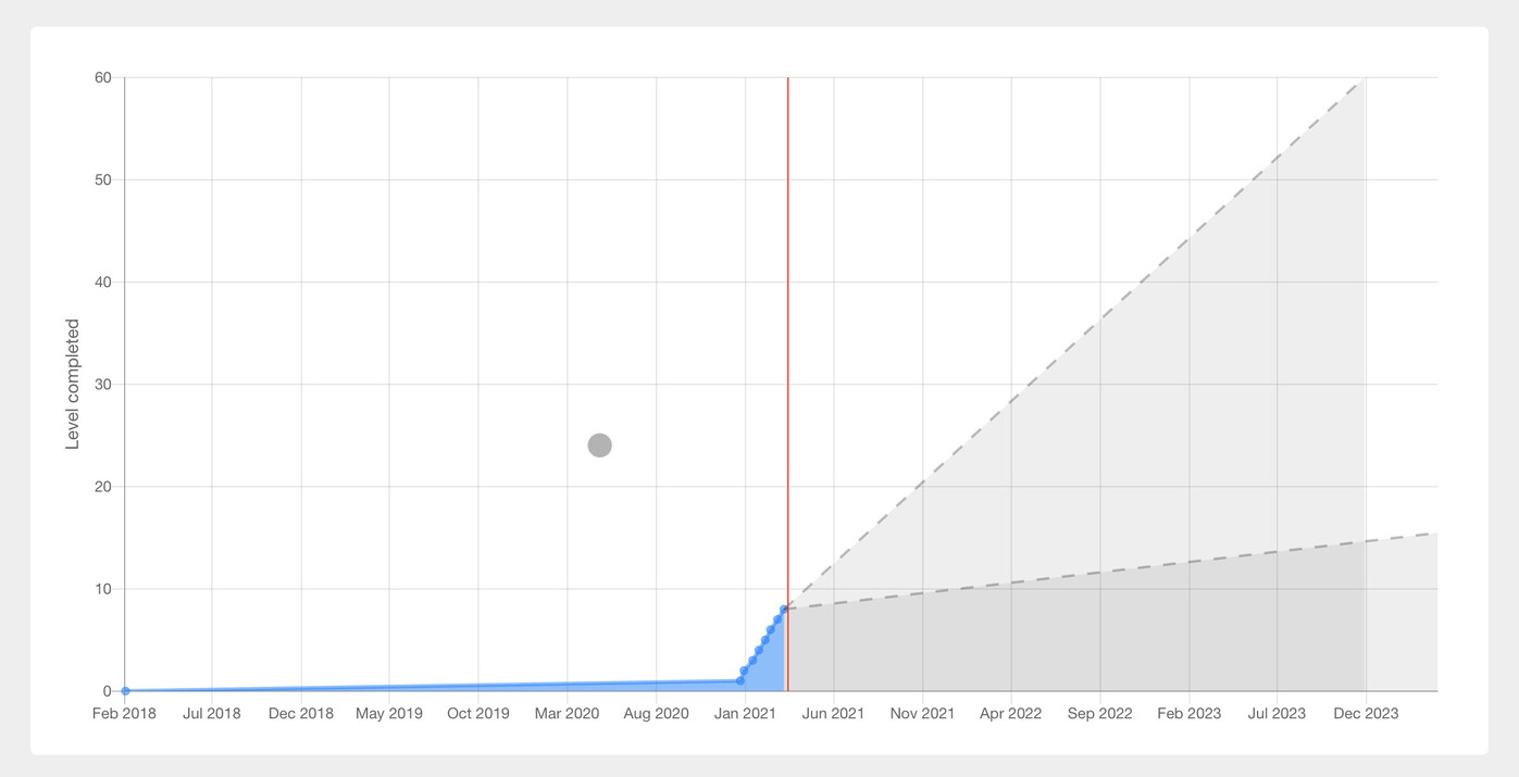
The blue section shows your level completion progress, while the gray part is a forecast based on an exponential moving average, with a bracket of two different alpha coefficients (in my case above they happen to coincide, but in general you should get two distinct grey lines.)
The vertical red line is today.
The red squiggly line shows you the speed at which you’ve been progressing, in levels per month. The maximum value is around 4.5 (1 level per week) although the right-side axis goes up to 6 for graphical reasons.
All in all this is a simple way to see where you are in the journey and when you can realistically reach the various levels, assuming you keep advancing at the same pace. It’s also a way to encourage yourself not to “slack off.”
Warning: if seeing a chart that is mostly gray or with dates several years from now will discourage you, do not use this app.
The website needs an API key (without any further permissions) and only stores it in your browser. The code is open source, you can check on Github and even rebuild the app if you are paranoid.
As a consequence of this, I have only access to my own account, so if you spot any issues on yours, please post a screenshot.
Logging for this endpoint has been implemented late in the application’s life. Therefore, some Users will not have a full history.
I’m not sure how to make you a full chart at all, if the API doesn’t include all the values. Maybe somebody else has more info on this. Can you post a screenshot of the chart you get?
Not possible. That kind of data was not available before Aug 2017. However, there should still be dates for unlock, start, passed, and burned, in each item’s assignment, if you want to do something for those users
edit: also can you add a link to the API keys page? I think that makes it easier to go get it
So if I understand this right, I should reach level 60 somewhere between Aug 2022 and Feb 2023? In simple terms, what are the two coefficients used for the extrapolation? Current tendency and average tendency?
I think it generally indicates the wrong level for each level, like somebody mentioned: It starts at 0 instead of 1, and my current level is also one level lower in your app than in reality. (Apologies if you did not deploy yet, but it is not fixed for me as of now.)
Yes. In your case, the earlier estimate seems more likely (it better fits the last few points on your blue line.)
I started from the observation that some levels are done faster, other slower, depending on how much effort you put into it (and how difficult the level is.) Therefore, what speed should the chart use for the forecast? The speed at which you completed your last level? Or the average of your last N levels?
What I chose (quite arbitrarily) is to have 2 lines, each using a combination or “average” of speeds from the last few levels you completed.
The first line has 50% = 1/2 of its speed taken from the last level you completed; 1/4 taken from the second to last; 1/8 from the one before that; and so on.
The second line has only 25% = 1/4 of its speed taken from the last level you completed; 1/8 from the second to last; and so on. Therefore the second line takes more of your history into account.
In your case, the second line shows a longer estimate because it’s taking your “break” in the second half of 2020 into account, while the first line is more based on your recent sprint.
When I coded this I had no idea there was even a reset option in Wanikani! After TimeStamp posted his chart, I added the “white gaps” whenever a reset occurs. I also added an option to show levels that are completed, but which don’t have an N+1 level following it, such as the last level 60.
In any case, the chart shows the level you “reached” so if you reset, it stands to reason that it would show the previous number. I think?
Sorry! I did test it on mobile emulators (the developer tools in Firefox) and I decided to make it so that you could scroll it sideways. But I haven’t gotten around to test it on my actual phone, so I’m not sure how well it works on mobile yet.
The idea of the chart is to show the levels you completed, not the ones you are still working your way through. For example, I’m at level 12, but I haven’t completed it yet, so my chart won’t show a dot for level 12, because it would not know at which date to place it (will I clear it today? tomorrow…?)
That’s also why it starts at zero, because when you join Wanikani, you are at zero completion.
I changed the labels to make it clearer (now it says “Level completed”) but for these reasons, I’m not sure I should add +1 to each value.
That’s going to be a bit harder, because it’s not an image to begin with. I’ll see what I can do.
Said it another way, each point of the chart shows the date you completed that particular level N (and began studying level N+1.)
If I showed the date you started level N, as some people seem to prefer, then what should I display on the date when someone completes level 60? Should I show 61? Should I omit that date from the chart?
Hm, I see. I find that a bit counter-intuitive, as the WK level numbering works differently, and so this introduces a bit of mental friction for me when I look at your app telling me:
while at the same time e.g. Heatmap tells me
and also WK shows my level on the dashboard as 39, not 38.
I think it might be a bit better if you’d put “Completed Level: 38” in the box?
(Also, now I’m wondering: How can you indicate Level 60 as there is technically no “Level 60 completed” point in WK as far as I know? Do you make this up yourself?)
I did level 1, then went away for 3 years, then restarted in earnest in late december, which makes my graph a little wonky. Any way to get it to ignore that first data point and only pay attention to the current stuff?
Looks really neat! If you’re using the level completion times for the predictions would it also be possible to add a toggle for “Average” and “Median”?
E.g.:
I took a longer pause but have every intention of continuing with my previous pace. The predictions make the completion date look way further in the future then what I have calculated by myself though.