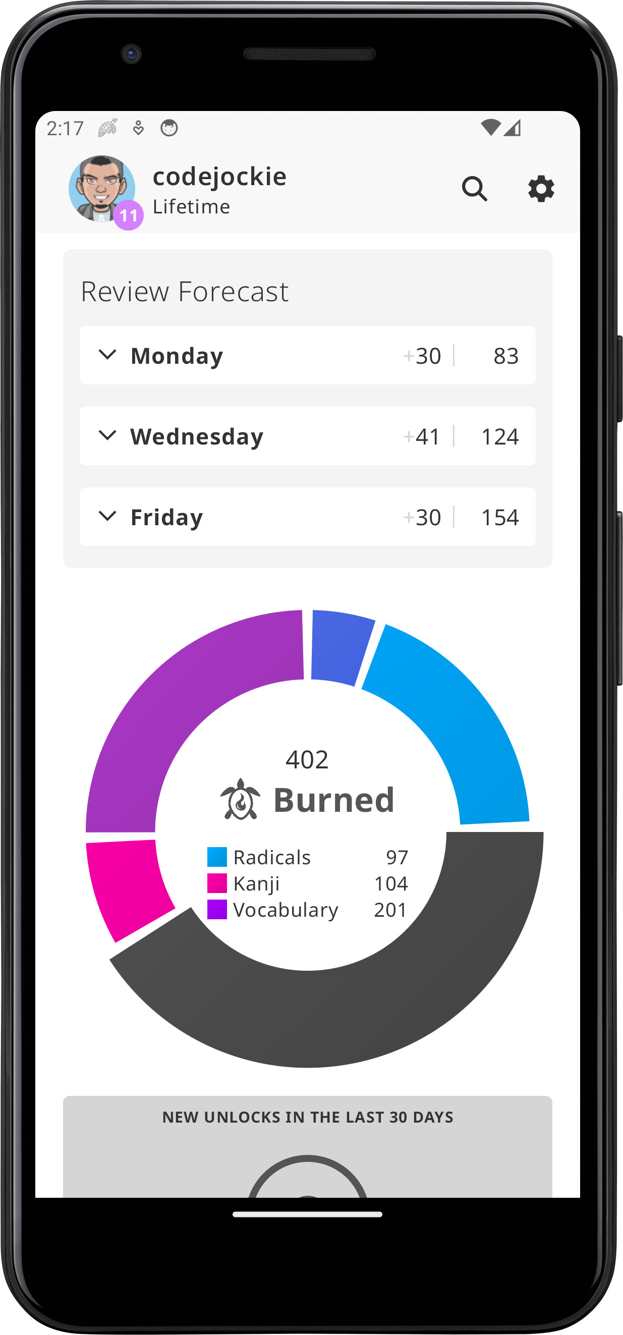
Yes, running the latest version. I left using either the system back button or the home button at the top left (can’t remember specifically), which brought me back to the dashboard. The review count has updated correctly (it was 50+, went down to 20).
Then after a few seconds resumed the reviews. I don’t remember the total number that showed up in the top right, but I kept doing them until the app automatically threw me back to dashboard, where I could see there’s still 6 more items. Trying to resume didn’t work, it just got stuck loading.
Alright, there were a few issues here and there, like very old recent mistakes (from a few days ago), wrong numbers in the level cards (e.g. it was saying I had like 40 burned items, when it’s close to 800), and some other inconsistencies… maybe this had something to do with the issue I observed.
Maybe some earlier bug kept affecting the app. Another possibility is that all of this is because the first time I set up the app, my internet connection was kinda flaky (I noticed some of these wrong values since day one, but assumed it was API limitations at first).
Anyways, after clearing the data and setting everything up again, all stats and everything seems alright
Yes, that is the slide I meant. That slide is supposed to show a max of 3 vocabulary but it seems you are only seeing 1.
Chirp kanji should show max of 3 vocab — 鳴く、鳴き声、そして鳴る
I can’t say why that would be the case. I tested the app with a Pixel 5 emulator and I saw all visible 3. The behaviour might just be different on a physical device.
Sorry for the late reply! I’m on mobile, so I can’t really quote your replies, sorry for the mess.
For the immediately repeated reviews, I think it might be because I set the review order to “Lower levels first” (it happened regardless of Wrap Up or not). Maybe it might still make sense to put the review back a little bit later in the queue.
For the weird skip during wrap up, I have a (bit of a lengthy) video. Took me some time to reproduce it, but hope it helps to understand what I wasn’t able to put into words https://photos.app.goo.gl/KsvvggqZTZiCLkh4A
It skips from the wrong answer to 転ぶ to 船員.
Makes sense. About your suggestion, I might consider it.
That’s a nasty bug that will be fixed.
I see the point you are making and it makes sense. The way I look at it is, if the combined column were not shown, the natural way one would think of the combined percentage would be to take the average, hence, why I have it the way it is.
What does that mean?
Expected, since you can only finish 10. If you have more, they are lost.
Hi there! Found a few issues here and there, hope you fix’em up.
I’m facing a really weird issue with lessons, that wasn’t happening before I reset the app anew.
I can do lessons normally, however if the number of lessons I start gets split into batches (i.e. in the default configuration of 5 per batch, it’s anything higher than 8 lessons), I just get a blank screen, with nothing at all. Pressing back takes me back to lesson picker / dashboard. Tried clearing cache from inside the app, closing / force stopping, with no avail.
Another thing is that sometimes the Japanese font uses a thin font weight. It’s intermittent, only happening sometimes. Probably has something to do with the switch to a variable font? See pictures below:
Accidentally came across this, have no use for it personally, but the header takes too much space in landscape. Unsure if it’s worth changing though, not sure if anybody would use landscape on mobile (the keyboard would cover most of the screen anyways :P)
The UI doesn’t update after adding a user note while doing lessons. I can see the notes afterwards if I visit the lesson from the item list, though there was at least one instance where the note I wrote wasn’t saved at all.
That’s all for now!
One more thing
Worked on this today, with an identical look to WaniKani’s style. It’s not a very trivial (nor clean) implementation, but it’s not too crazy either. More info and code in Gist.
I adapted @skaldebane’s code to make the mnemonic/hint text have a 3D like form similar to the website and here are screenshots of what they will look like in an upcoming update.
Yeah, it’s pretty weird, especially as it was working fine in the same version before I reset
I’ll try reinstalling and report back to you. Edit: Reinstalled, and now things are working properly
That looks awesome in the app!
One thing I’m noticing though is that the text alignment is a slightly off between the text in the ‘card’ and the rest of text, in all lines except the last one. The baseline is a 少し higher.
More rambling on that
There’s many things that may cause that.
Generally, 3 things are needed to keep alignment correct:
Text outside and inside have exactly the same styles (e.g. size, font), except colors and shadow, and others that don’t affect layout. Excluding lineHeight (see alternative solution below)
Using PlaceholderVerticalAlign.Center to center the inline content. There’s also PlaceholderVerticalAlign.TextCenter. I don’t know if there’s any difference between them, as they behave identically for me, but maybe it depends on font. Try the second one and see.
Padding on top and bottom of the card must be equal. This includes both padding inside the painted area, as well as outside (above drawBehind in this case).
I suspect the issue here is (3), the padding. Didn’t mention this in the gist, but I experimented with adding a padding(bottom = 1.dp) to add spacing between lines (so cards don’t touch each other) and it caused misalignment, so I scrapped it.
You could however do padding(vertical = 0.5.dp) or something similar, where you still keep top and bottom paddings equal, while still spacing things out.
And of course update the placeholder height to reflect the total padding, e.g. in this case:
you’ll want to update 4.dp to 5.dp to accommodate for the extra 0.5.dp on each side.
Alternatively
You could skip all of that and just change the lineHeight (but only for the outer text, don’t apply it to the measurer) to add enough spacing. That way it’s consistent even in lines without the inner content.
All of this assumes that paddings are the issue, but it can be something else, maybe even some font rendering quirk in Android that’s out of our control.
Not a big deal in any case, it’s barely noticeable.
For 1, they are the same.
For 2, I didn’t see any difference visually.
The issue has to do with both padding and placeholder height. I experimented with your suggestions but didn’t get my desired look. I want the highlighted text to not touch each other so after more tweaking I came to a middle ground — prevent touching while keeping the text alignment close to the surrounding text. At this point, I decided to put my time into doing something else.
Notice, the text is just slightly above the baseline but less visible. For this I just removed the padding all together, while adding 1.2dp to the placeholder height.
A year ago, I joined this vibrant community to share news of the app I was creating behind the scene. I feel a bit of nostalgia looking back to the progress made so far and how amazing you all have been. This would not have been possible without you, so I am very thankful and appreciative of the feedback, likes and testing you all have carried out since the first release.
I recall the first release was a bum as the app wouldn’t even launch on installing it – spent a good amount of time figuring that one out .
A big shoutout to @aypro2k who was the first tester to kick things off then @Darkdray. I want to say thank you to the testers and everyone who have ensured the app worked as intended and have contributed to the features of the app.


 .
.