Thought the forums were a bit bland, so I made a userstyle for it. It’s a transparent theme for use with a background image of your choosing.
I made this for myself, with a specific background in mind, so it will probably not look great with just any image, but I’m sure you can find one which looks good if you’re willing to compromise. The background image URL is located at the top of the style so it’s easy to change, though there is also an option to set it permanently. Currently there are a few other options available as well, though they might not work exactly as intended; as I am not using them myself they have not been extensively tested.
If you have any thoughts or complaints feel free to voice them.


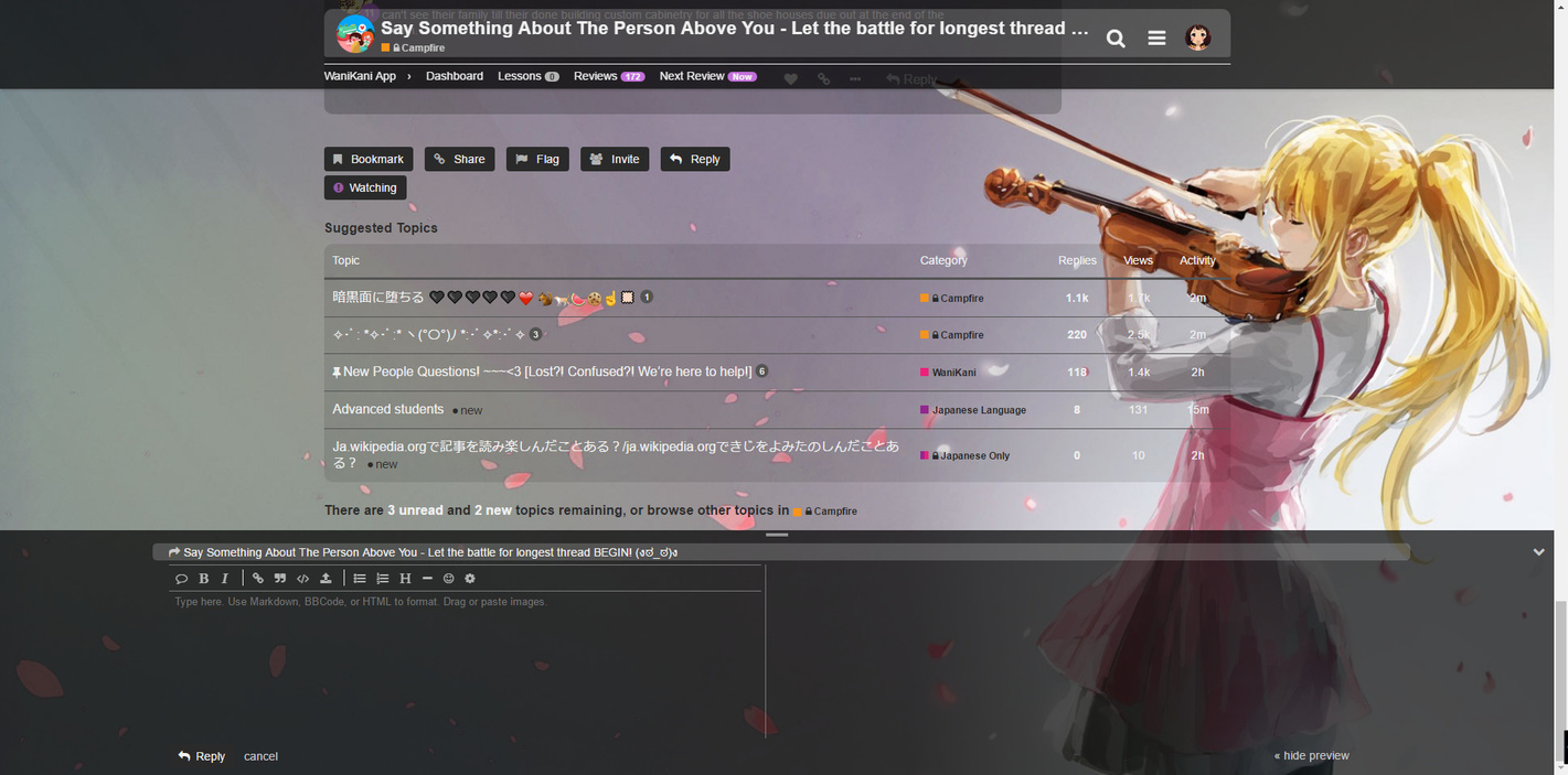

The theme can be installed through userstyles.org
Version history
v.1.2.19. Lots of bug fixes due to changes in the Discourse platform
v.1.2.18. Removed the annoying message about private messages not being private
v.1.2.17. Fixed tracking glyph colors and the tracking menu
v.1.2.16. Fixes after recent forum changes
v.1.2.15. edited for compatibility with my Spongebob time cards script
v.1.2.14. added compatibility with my Spongebob time cards script
v.1.2.13. Fixed some things after forum updates
v.1.2.12. Fixed color of visited threads in ‘Latest’ tab and changed the color of categories in a few places
v.1.2.11. Fixed dropdown selections… for the third time. Made topic titles white on black
v.1.2.10. Fixed the colour of the “who liked” text and made categories slightly less white
v.1.2.9. Styled the new “Also writing” box
v.1.2.8. Fixed a few changes in colour due to recent forum update
v.1.2.7. Changed the loading spinner into a rotating heart instead to match the default
v.1.2.6. Changed the loading spinner into a fading heart and added background image option
v.1.2.5. And the user summary page
v.1.2.4. Made ticked box mark green in notifications as well
v.1.2.3. Fixed the white bar in topic maps
v.1.2.2. Made solved thread markers green again
v.1.2.1. Fixed clicking on spoilers
v.1.2.0. Added some options
v.1.1.5. Fixed a bunch of stuff which broke after forum updates
v.1.1.4. Refixed the solutions thing
v.1.1.3. Fixed the new “solution” thing; fixed the thread timeline for smaller screens
v.1.1.2. Fixed mentions’ text colour in preview and added color to recent edits
v.1.1.1. Fixed a # autocomplete that I thought I had already fixed
v.1.1.0. Reorganised the code, fixed bugs, edited some small stuff.
v.1.0.6. Added moderator highlights, fixed show replies button hover background, fixed 0 review count color.
v.1.0.5. Number of lessons in header are now the right color
v.1.0.4. Fixed oneboxes in quotes, a button border, and something else
v.1.0.3. Made the header static when opening images.
v.1.0.2. Removed a margin edit which caused problems on the front page for some. Fixed a few unstyled elements in preview when writing replies.
v.1.0.1. Fixed tracking settings hover. Styled advanced search, which I had missed.
v.1.0.0. Finally done, still need to make the css itself look a bit less like puke


