oh thanks for the help, yeah I tried locking and unlocking for several times and somehow it did the trick on the last attempt hahaha!
1 Like
Glad it worked out ![]()
Instead of getting it to Enlightended I keep getting the Kanji 知 wrong. Because I can’t remember eh On-Reading.
It’s a level 6 Kanji and the first time the ち reading appears in a word is at level 17…
1 Like
Write it down ten times, with the kanji and vocab readings. This usually helps me with persistent leeches.
Well that’s the point, the first vocab with that reading comes up at level 17 and I’m at 12. Of course I know 知る. Well, now that I’ve complained I’ll probably remember the ち reading too.
1 Like
That’s exactly the point ![]()
Might also want to check out some leech related scripts!
Here’s a complete and utter noob question/comment/observation:
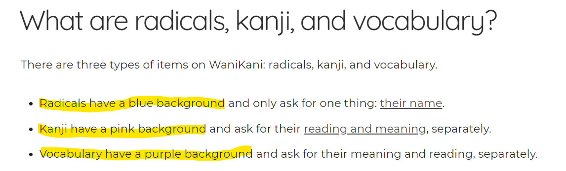
I’ve gone through the guides and the FAQ and nowhere could I find it explained that the colour of the background in reviews actually matters! I thought it was just an aesthetic choice for the web designers! I saw the FAQ on the colours as they pertain to levels and as I don’t really care about that, but just want to proceed at my own self-study pace.
Then here I am, looking at 下. Uhm… か! No, loser, it’s した! Blabla on-yomi, blabla kun-yomi. But, but, I just only did my review yesterday and it was か!
Oh, wait… that one was with a blue background, this one had a pinkish tint. Does that make a difference? Apparently it does! Blue is the radical, pink the Kanji. (and Purple is for vocab?)
What do colourblind people do? Is this actually clearly explained or am I just too old and dense (OK, boomer) when everybody else just got it?
2 Likes
Under the coloured area it will say ‘radical’, ‘kanji’ or ‘vocabulary’ so the colours are just backup. I still mix them up all the time. I need to force myself to count to three before hitting the button
2 Likes
Argh! I never even consciously noticed that even thought it’s right there! It’s just like my brain is just going into Kanji-Rorschach mode that it can barely parse English anymore.
I am indeed going to do a mental 3-second count, maybe a sort of checklist (radical-kanji-vocab? on-kun?)
Is there a userscript that asks “are you sure? are you absolutely sure? do you REALLY mean it?”
Thanks for the reply!
1 Like
![]() I understand completely
I understand completely
1 Like
< bursts into tears >
too
much
data
(。T ω T。)
5 Likes
Hi!
So I was doing well and then today I levelled up to level 2 and now I have SIXTY THREE new items/lessons. I am terrified. So I was just wondering… is there any guide/tips for how much I should be doing at once? I’m just worried that if I do too many lessons I’ll end up confusing myself but I’m worried if I go slowly that would be bad as well.
Helppp
2 Likes
Do as many as you feel like. Nothing at all bad about going slow.
2 Likes
Most people don’t do all lessons at once (although there are some people that do). The general preference is to do a set number each day but the number depends on the individual. Things like how good your memory is and how much time you can afford to spend on Wanikani affects this number. 20 lessons a day is a good starting point. You can adjust upward or downward afterwards depending on how good it works for you.
1 Like
If you look around there are a few schools of thought.
One method is to keep your ‘Apprentice’ number below 100 and only do new lessons if you are below that number.
Another is to pick a number of daily lessons (10, 20) and stick to it.
Everyone agrees you shouldn’t do new lessons if you still have reviews.
頑張って
3 Likes
@Taniotoshi @prouleau @Belthazar
Thank you so much for your help! That makes me feel a lot better!!
2 Likes
These are good tips but this is not an either or choice. Many people do both. They don’t do lessons when the Apprentice count is high and when they do lessons they stick to a fixed number. The logic is that a high Apprentice count generates a lot of reviews. By keeping it low you control your review workload. As you are still a level 1 or 2 user so this is not much of a factor but as you progress you will increasingly need to do this.
Doing lessons while you still have reviews increases the size of your review pile. People with a big review pile stop doing lessons until the reviews are back under control.
5 Likes
Hey, I’m thinking of getting the membership, but before that could anyone answer my question. If I subscribe for a month and complete lessons after level 3 (the ones that you can’t do for free). Then if I cancel my subscription will I still be able to do the reviews for my higher level radicals, kanji, vocab?
1 Like
Only lessons and reviews for items from the first 3 levels can be accessed if you are unsubscribed. Anything you did from level 4 and beyond will remain in the state it is and be accessible if you resubscribe at a later date, but you won’t be able to do those reviews in the meantime.
5 Likes