This is a third-party script/app and is not created by the WaniKani team. By using this, you understand that it can stop working at any time or be discontinued indefinitely.
If you like the new extra study feature, but think that the positioning of the ui item isn’t convenient or hides other stuff, this script is for you.
Features
After adding the script, a small cog will appear in the corner of the extra studies panel. Clicking on this will let you set the position and the style of the panel and possibly remove the info questionmarks.

The different positions
Top:

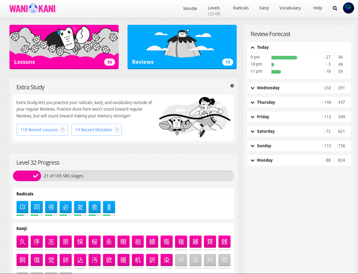
Above level progress (the original):
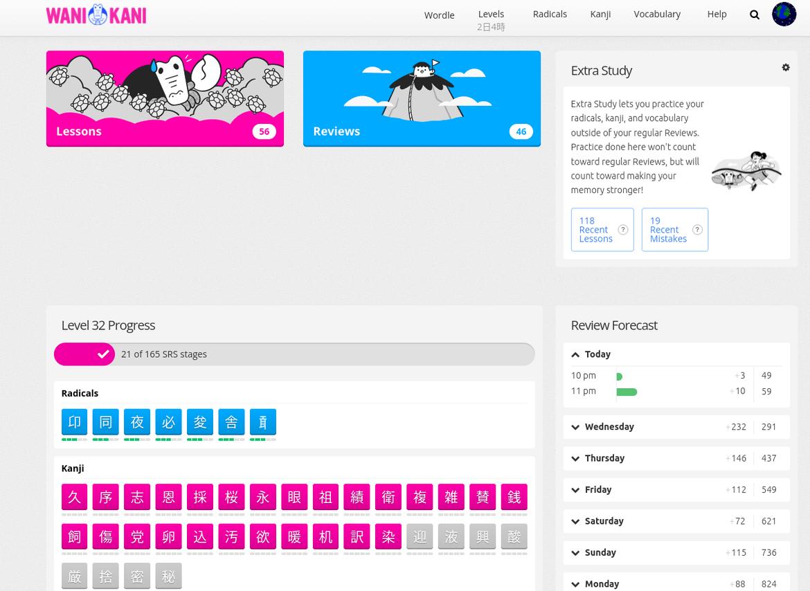
Below level progress (the default):

Above item breakdown:

Below item breakdown (and heatmap):

Above review forecast (I recommend using a reduced or minimal style for this):
Below review forecast:

In the header:

None is pretty self explanatory (The settings button gets put into the user menu this way)
The different styles
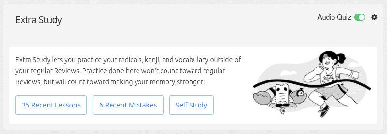
Normal (the usual and the default):

Text only:
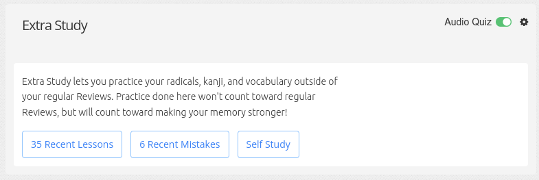
Image only:

Reduced (the text and the image removed):

Minimal (only what’s necessary):


Button orientations
Horizontal

Vertical

You can also have the “Recent Mistakes” panel removed with the “Good Mojo” option, if you dislike seeing how many mistakes you’ve made recently.

Installation
Guide on how to install a userscript
Link to the userscript
Feedback
If you want a different position or style, or one of the existing ones is acting up for you, feel free to leave a reply, preferably with an example image, and I’ll see what I can do
For userscript authors wanting to support the script
I’ve added some classes to the extra study element to signal that extra study mover is in operation. These are:
- es-mover: the script is running
- es-mover-header/top/above-lp/…: The exact positioning of the box
- es-mover-normal/reduced/minimal: The current style of the box
Changelog
- v0.8.0: Adapted to the “recent mistakes” changes, and made it possible to remove that
- v0.7.0: Adapted the script to the new dashboard changes
- v0.6.2: Now supports Kumirei’s “Lessons & Reviews in header” script
- v0.6.1: Added a small gap between items in horizontal mode
- v0.6.0: Fixed compatibility issues, added button orientation
- v0.5.0: Added a none option to the position
- v0.4.2: Bumped CIDDWA dependency
- v0.4.1: Fixed several smaller bugs
- v0.4.0: Big compatibility and code changes
- v0.3.3: Removed the leftover button from the user menu
- v0.3.2: Solved some minor issues and added dashboard compatibility for header mode
- v0.3.1: The header option is now a dropdown with all the buttons inside
- v0.3.0: Now there’s an option to put the buttons in the header
- v0.2.2: Now supports breezy dark out of the box
- v0.2.1: Below item breakdown was missing
- v0.2: You can now select the positioning and the style
- v0.1: Initial


